Cost Increase Rate Analysis Chart
RM0600007_15
- Last Update 02/25/2025
- File Size 0.5MB
- # of Slides 2
- File Format PPTX
- Slide Ratio 16:9
- Color
Keywords
- #Content-Based Slides
- #Design-Based Slides
- #Financial Plans and Performance
- #Diagram
- #Graph
- #Budget
- #Sales and Revenue
- #Table
- #Line
- #Line Chart
- #16:9
- #line chart PowerPoint slide
- #trend analysis presentation template
- #revenue growth chart
- #cost analysis graph
- #3-year data visualization
- #how to create line chart in PowerPoint
- #financial data PowerPoint slide download
About the Product
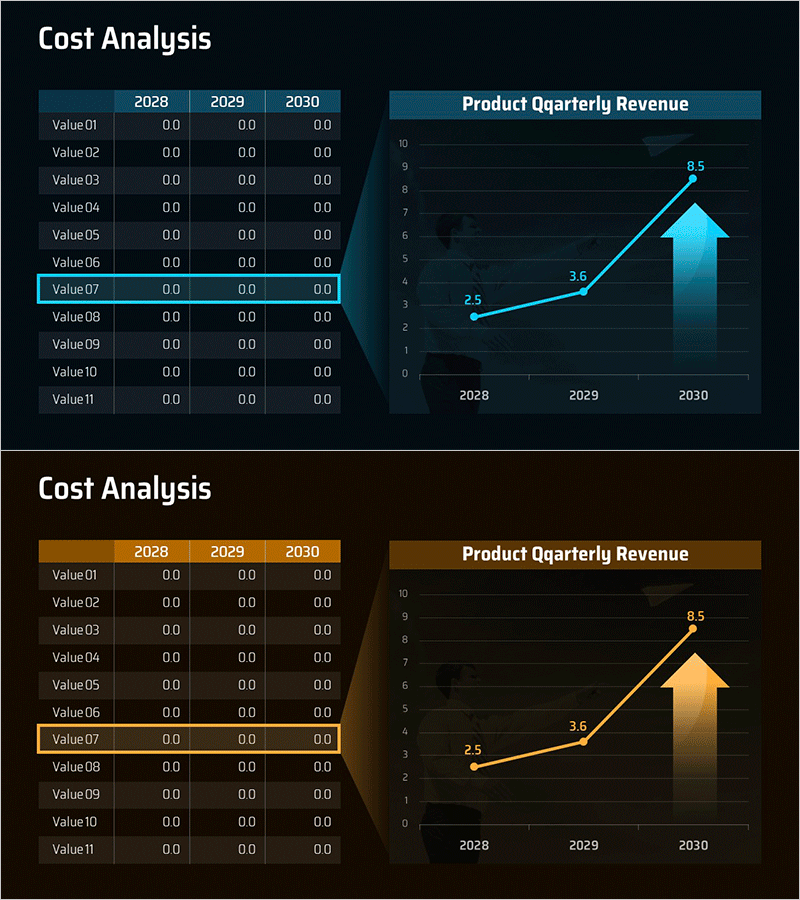
A line chart PowerPoint slide that visualizes cost increase rates and quarterly product revenue growth over three years. The slide features a dark background with cyan-blue line series and an upward arrow accent element that emphasizes growth trajectory. The left side displays a data table with Value01 through Value11 rows for detailed numerical input across 2028, 2029, and 2030. Two data series are plotted on the right-side line graph, showing progression from 2.5 to 3.6 to 8.5. This presentation slide is ready for immediate use in financial analysis, business planning, investor pitch decks, and performance reporting.
Usage Points
-
Main Usage
Visualize annual or quarterly cost, revenue, and performance trends using a line chart to communicate growth rates and directional changes at a glance. The dual-structure layout combining a left-side data table with a right-side graph delivers both numerical precision and visual impact for executive-level presentations.
-
How to Use
Replace the Value01 through Value11 item names and year-by-year figures in the left table with your actual data. Update the line graph data points (2.5→3.6→8.5) to reflect your trend values, and adjust line colors and styles as needed. Use the upward arrow accent element to reinforce growth messaging and draw attention to key performance indicators.
-
Recommended For
Finance teams presenting cost analysis reports, quarterly performance briefings to executives, investor relations (IR) presentations, revenue forecasting sections in business plans, and marketing teams sharing growth metrics. Particularly effective for multi-year comparative analysis in board meetings and C-suite reporting scenarios.
-
Slide Structure
Two-slide set. Slide 1: Dark background with left-side 11-row data table (2028–2030 years), right-side line chart with 2 data series and 3 data points on Y-axis scale 0–10. Slide 2: Identical layout in warm brown-gold color scheme. Table-to-graph visual linkage enables easy numerical tracking and data correlation.
Related Products
-

Business Outlook Analysis Chart – Future Predictions and Planning
#Financial Plans and Performance #Diagram #Graph
-

Production Cost Variance Analysis Chart – Visualizing Financial Performance
#Financial Plans and Performance #Diagram #Graph
-

Business Operation Cost Analysis Graph – Core of Financial Planning
#Financial Plans and Performance #Diagram #Graph
-

Selling Cost Analysis Chart – Clearly Illustrating Financial Performance
#Financial Plans and Performance #Diagram #Graph
