Graph of Operating Cost Reduction Strategies
RM0600005_15
- Last Update 02/24/2025
- File Size 0.4MB
- # of Slides 2
- File Format PPTX
- Slide Ratio 16:9
- Color
Keywords
- #Content-Based Slides
- #Design-Based Slides
- #Financial Plans and Performance
- #Diagram
- #Graph
- #Budget
- #Sales and Revenue
- #Table
- #Standard Table
- #16:9
- #line chart PowerPoint slide
- #multi-series trend analysis
- #cost visualization template
- #financial data presentation
- #how to create line chart in PowerPoint
About the Product
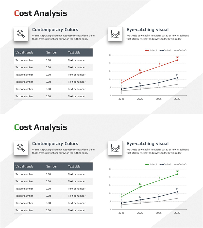
A multi-series line chart PowerPoint slide for visualizing operating cost reduction strategies from 2015 to 2030. The slide features three data series represented in red, black, and gray lines, with clear trend visualization and numerical labels at each data point. The left section includes Contemporary Colors and Eye-catching visual descriptions, while the right side displays the line graph with X-axis spanning 2015–2030 and Y-axis from 0–25. This slide template is ready for immediate use in financial reports, strategic presentations, and cost management briefings.
Usage Points
-
Main Usage
Visualize operating cost reduction trends across three data series over a 15-year period. The line chart enables clear comparison of cost trajectories, forecasted values, and goal achievement across multiple scenarios or departments in a single view.
-
How to Use
Insert this slide into financial reports, executive strategy presentations, quarterly performance reviews, and investor briefings. Replace placeholder data in the table and line chart with actual cost figures. The dual-panel layout allows narrative explanation on the left and data visualization on the right for comprehensive storytelling.
-
Recommended For
CFOs, financial analysts, business strategists, management consultants, project managers overseeing cost optimization initiatives. Ideal for presentations to C-suite executives, board meetings, investor relations, and internal performance reviews where cost trend analysis is critical.
-
Slide Structure
Two-slide set. Each slide contains a left-side table (Visual trends, Number, Text title columns with 6 data rows) and a right-side line graph. The graph displays three series (red, black, gray) plotted against years 2015–2030 on the X-axis and values 0–25 on the Y-axis, with numerical labels at each data point.
Related Products
-

Market Analysis Graphs & Tables – Visualizing Sales Growth
#Market and Competitor Analysis #Financial Plans and Performance #Diagram
-

Production Cost Variance Analysis Chart – Visualizing Financial Performance
#Financial Plans and Performance #Diagram #Graph
-

Sales Outlook Analysis Segmented Graph – Visualizing Financial Performance
#Financial Plans and Performance #Diagram #Graph
-

Parallelogram Graph & Table – Visualizing Product/Service Introduction and Financial Performance
#Product/Service Introduction #Financial Plans and Performance #Diagram
