Liquor Sales Chart – Market Analysis and Performance Management
RJ0600043_16
- Last Update 07/02/2025
- File Size 0.2MB
- # of Slides 2
- File Format PPTX
- Slide Ratio 16:9
- Color
Keywords
- #Content-Based Slides
- #Design-Based Slides
- #Market and Competitor Analysis
- #Financial Plans and Performance
- #Diagram
- #Graph
- #Market Analysis
- #Sales and Revenue
- #Table
- #Circles
- #Standard Table
- #Doughnut Chart
- #16:9
- #doughnut chart PowerPoint
- #pie chart slide template
- #sales ratio analysis
- #circular graph presentation
- #data visualization PPT slide
About the Product
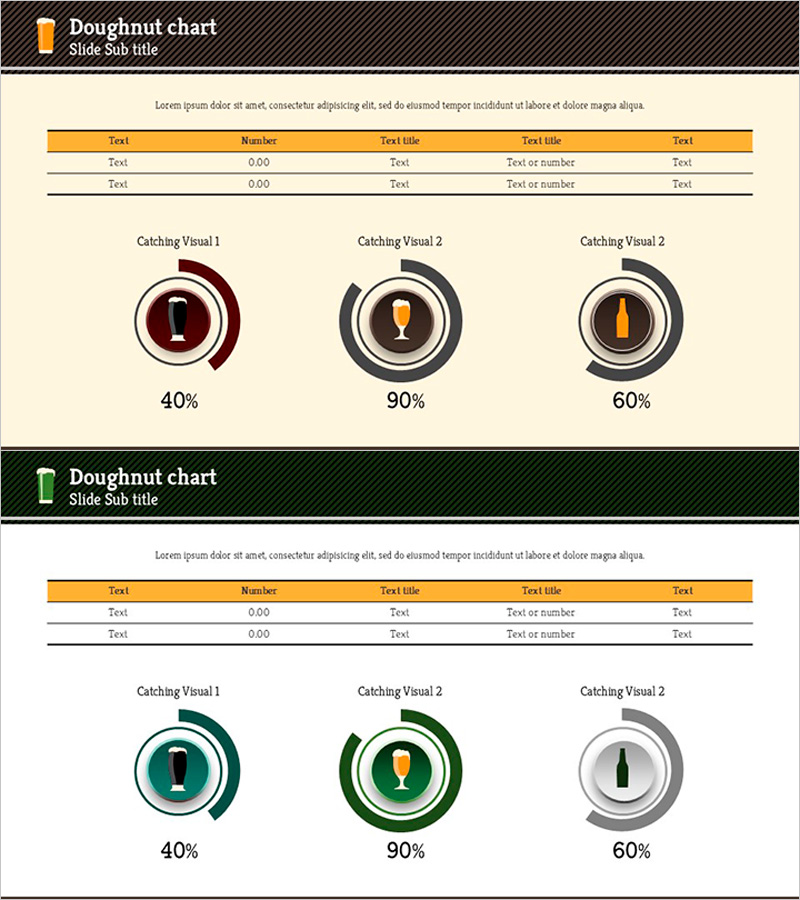
A doughnut chart PowerPoint slide designed to visualize liquor sales data with clarity and impact. The circular graph is divided into three segments using orange, wine red, and charcoal colors to represent market share, product-category revenue distribution, and channel-based sales composition. Each slide includes an editable data input table for real-time numerical updates, making it ideal for business reports, financial presentations, and sales performance analysis. Delivered in 16:9 widescreen format with 2 slides in PPTX file type.
Usage Points
-
Main Usage
Display liquor industry sales performance, product category revenue breakdown, and distribution channel composition using a doughnut chart format. Enables stakeholders to quickly understand market share and performance metrics at a glance.
-
How to Use
Input actual sales figures and quantities into the data table at the top of the slide, and the doughnut chart automatically updates. Color-coded segments clearly distinguish product lines, channels, or regions, allowing you to emphasize specific performance areas during presentations.
-
Recommended For
Ideal for liquor manufacturers, distributors, and retailers presenting quarterly or annual performance reports, investor presentations, marketing strategy meetings, and sales performance analysis. Suitable for finance teams, sales departments, and executive-level reporting.
-
Slide Structure
2-slide set. Each slide features a title and description area at the top, a 5-row by 5-column data input table in the center, and three doughnut-shaped pie charts at the bottom displaying sample data (40%, 90%, 60%) that update with your inputs.
Related Products
-

Detailed Analysis of Shareholder Status Donut Chart
#Company Introduction #Market and Competitor Analysis #Diagram
-

Fantastic Donut Chart – A Slide for Effective Market Analysis
#Market and Competitor Analysis #Financial Plans and Performance #Graph
-

Regional Demand Survey Graph – Key to Market Analysis
#Market and Competitor Analysis #Financial Plans and Performance #Graph
-

Analyzing Market Share with 3 Donut Charts and Tables
#Market and Competitor Analysis #Diagram #Graph
