Orange Green Profit and Loss Chart – Visualizing Revenue and Profit
RJ0500033_9
- Last Update 06/16/2025
- File Size 0.5MB
- # of Slides 2
- File Format PPTX
- Slide Ratio 16:9
- Color
Keywords
- #Content-Based Slides
- #Design-Based Slides
- #Financial Plans and Performance
- #Diagram
- #Graph
- #Income Statement
- #Sales and Revenue
- #Table
- #Column
- #Standard Table
- #Grouped Column
- #16:9
- #clustered bar chart PowerPoint
- #profit and loss chart slide
- #revenue profit comparison
- #financial graph template
- #2-series bar chart
- #earnings analysis presentation
About the Product
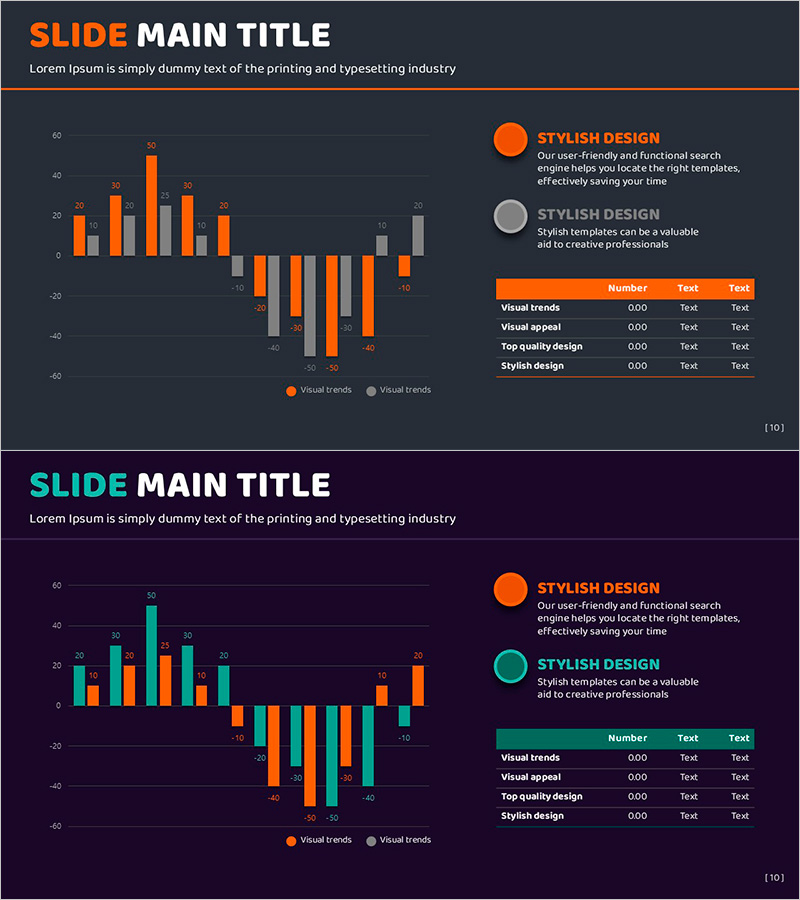
A clustered bar chart PowerPoint slide that visualizes revenue and profit side-by-side for direct comparison. Orange and green bars represent two data series in both horizontal and vertical layouts, making positive and negative values instantly clear. Perfect for financial reports, business plans, and quarterly earnings presentations where you need to compare sales trends and profitability at a glance. The 2-slide set includes multiple data scenarios ready to customize, with fully editable text, labels, and legend elements.
Usage Points
-
Main Usage
Designed to display financial performance and profitability metrics simultaneously. The two-series clustered bars allow viewers to compare quarterly or annual revenue against net profit, revealing growth rates and profit margins in a single visual. Ideal for investor presentations, shareholder meetings, and executive briefings where financial health is a key message.
-
How to Use
Adjust bar heights and colors to match your actual financial data. Update the legend and axis labels with your company's accounting terminology, and add explanatory text in the right-side text box as needed. Both horizontal and vertical orientations are included, so you can choose the layout that best fits your presentation flow.
-
Recommended For
CFOs, finance managers, executives, investor relations teams, and business development professionals presenting quarterly results, annual financial reports, and investment pitch decks. Also suitable for startup pitches, bank loan applications, and consulting proposals where demonstrating financial credibility is essential.
-
Slide Structure
2-slide set featuring a horizontal clustered bar chart (approximately 10 data points, 2 series) on the first slide and a vertical clustered bar chart on the second. Each slide includes a title and description text area on the right, with legend and data labels fully customizable.
Related Products
-

Global Revenue Analysis Table – Table for Financial Performance Enhancement
#Financial Plans and Performance #Diagram #Other
-

Sales and Profit Calculation Table – Key to Profit Management
#Financial Plans and Performance #Diagram #Income Statement
-

Cyber Security Business Profit and Loss Statement
#Financial Plans and Performance #Diagram #Income Statement
-

Business Income Statement Table – An Essential Tool for Performance Analysis
#Financial Plans and Performance #Diagram #Income Statement
