Investment Profit Structure Donut Chart
RM0500004_12
- Last Update 02/20/2025
- File Size 1.4MB
- # of Slides 2
- File Format PPTX
- Slide Ratio 16:9
- Color
Keywords
- #Content-Based Slides
- #Design-Based Slides
- #Product/Service Introduction
- #Business Introduction
- #Diagram
- #Graph
- #Development Status
- #Revenue Model
- #Cluster
- #Circles
- #Closed Cluster Diagram
- #Doughnut Chart
- #16:9
- #donut chart PowerPoint
- #pie chart slide template
- #investment profit structure presentation
- #ratio visualization PPT
- #revenue breakdown slide
- #PowerPoint chart design download
About the Product
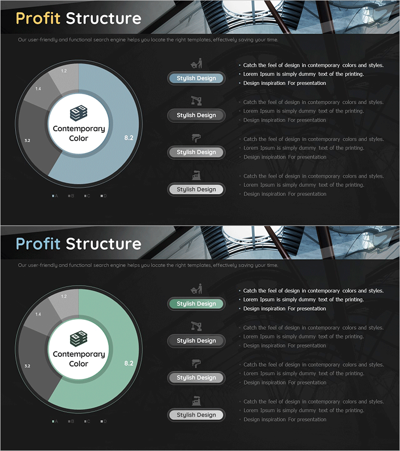
A PowerPoint slide deck visualizing investment profit structure using a donut chart design. This 2-slide presentation features a central circular area for core concepts and an outer donut ring displaying numerical ratios. The blue and green dual-tone color scheme differentiates data segments, while right-aligned callout text boxes provide detailed explanations. Ideal for financial presentations, investor reports, and business proposals that require clear visualization of revenue composition and profit distribution.
Usage Points
-
Main Usage
Visualizes investment revenue structure, profit distribution ratios, and revenue source composition using a donut chart format. The central circular area presents core concepts while the outer donut ring displays quantitative ratios, enabling simultaneous communication of both qualitative and quantitative financial information.
-
How to Use
Apply this slide in investment performance reports, financial analysis presentations, and business results briefings to explain revenue structure. Edit the four right-side callout text boxes with item-specific descriptions and adjust the donut chart colors and values to match your data for immediate deployment.
-
Recommended For
Recommended for CFOs, finance managers, investor relations specialists, and business planning teams presenting revenue structures. Particularly effective for startup investor pitches, corporate earnings presentations, and funding proposals requiring clear visualization of profit distribution.
-
Slide Structure
Two-slide layout with each slide featuring a central circular area (core concept text) and outer donut ring (2-4 segmented ratio sections). Four callout text boxes positioned on the right side accommodate detailed item descriptions. Color scheme uses blue, green, and gray tones to differentiate data series and enhance visual clarity.
Related Products
-

Corporate Profit Structure Analysis Donut Chart
#Product/Service Introduction #Business Introduction #Diagram
-

Cost Structure and Margin Analysis Chart – Donut Slide Providing Business Insights
#Product/Service Introduction #Business Introduction #Diagram
-

Automotive Technology Revenue Model Analysis Chart – Modern and Sleek Design
#Product/Service Introduction #Business Introduction #Diagram
-

Effective Use of Space Development Donut Circle Graph
#Product/Service Introduction #Business Introduction #Diagram
