Automotive Technology Revenue Model Analysis Chart – Modern and Sleek Design
RM0500003_12
- Last Update 02/20/2025
- File Size 1.4MB
- # of Slides 2
- File Format PPTX
- Slide Ratio 16:9
- Color
Keywords
- #Content-Based Slides
- #Design-Based Slides
- #Product/Service Introduction
- #Business Introduction
- #Diagram
- #Graph
- #Development Status
- #Revenue Model
- #Cluster
- #Circles
- #Closed Cluster Diagram
- #Doughnut Chart
- #16:9
- #donut chart PowerPoint
- #pie chart slide template
- #revenue model analysis diagram
- #automotive technology presentation
- #4-segment chart download
About the Product
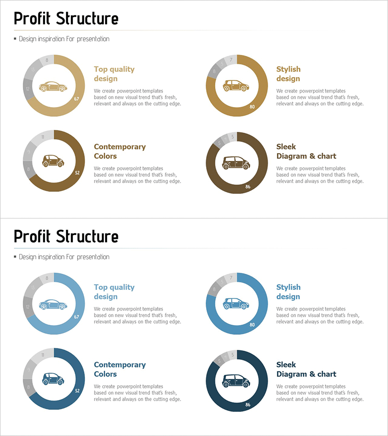
A PowerPoint slide featuring a 4-segment donut chart designed to visualize revenue models in the automotive technology sector. Two color scheme options are provided: warm tones in beige, brown, and gray, and cool tones in blue and gray. Each segment includes an automotive icon and descriptive text to communicate revenue structure intuitively. The 2-slide set is ready for immediate use in various presentation scenarios, with the central circular area designed to accommodate key messages or numerical data. This PPT slide is optimized for data-driven presentations and business analysis materials.
Usage Points
-
Main Usage
Clearly presents automotive industry revenue structure, technology segment revenue share, and business unit revenue distribution using a circular chart format. The donut structure allows emphasis of key metrics or totals in the center, making it highly effective for business analysis and financial reporting.
-
How to Use
Use in investor presentations, business strategy meetings, financial analysis reports, and technology innovation presentations to explain revenue composition. Replace section text and figures with your own data, select the color option that matches your presentation theme, and customize as needed.
-
Recommended For
Recommended for automotive industry executives, technology business unit managers, financial analysts, marketing strategists, and consultants preparing data-driven decision-making materials. Particularly valuable for revenue structure analysis, business portfolio reviews, and investor communication documents.
-
Slide Structure
2-slide set with the first slide featuring a warm-toned donut chart in beige, brown, and gray, and the second slide featuring a cool-toned donut chart in blue and gray. Each chart is divided into 4 segments with a central circular area and external text label space for easy data entry and description additions.
Related Products
-

Cost Structure and Margin Analysis Chart – Donut Slide Providing Business Insights
#Product/Service Introduction #Business Introduction #Diagram
-

Corporate Profit Structure Analysis Donut Chart
#Product/Service Introduction #Business Introduction #Diagram
-

Investment Profit Structure Donut Chart
#Product/Service Introduction #Business Introduction #Diagram
-

Effective Use of Space Development Donut Circle Graph
#Product/Service Introduction #Business Introduction #Diagram
