Analysis of Smart Network Systems – Data Visualization for Innovation
RJ0400061_6
- Last Update 06/03/2025
- File Size 0.3MB
- # of Slides 2
- File Format PPTX
- Slide Ratio 16:9
- Color
Keywords
- #Content-Based Slides
- #Design-Based Slides
- #Product/Service Introduction
- #Diagram
- #Graph
- #Composition
- #Development Status
- #Cluster
- #Circles
- #Closed Cluster Diagram
- #Doughnut Chart
- #16:9
- #donut chart PowerPoint
- #pie chart slide template
- #data ratio visualization
- #donut graph presentation
- #4-segment chart download
About the Product
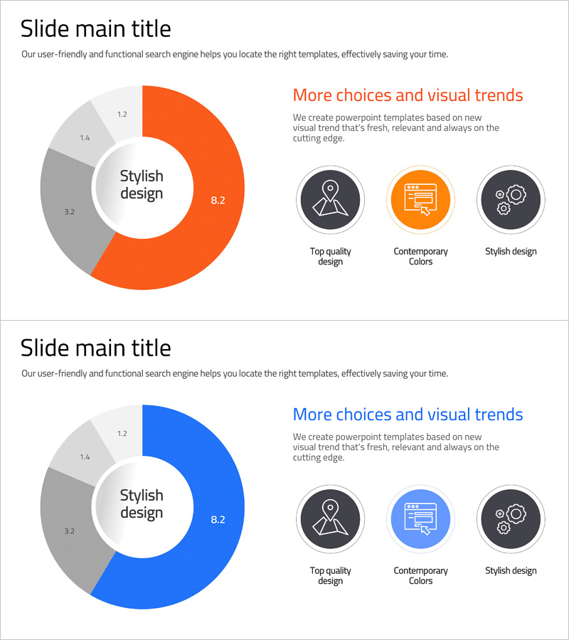
A donut chart PowerPoint slide designed for smart network system analysis and data visualization. The template features a center text area with a 4-segment donut chart structure that simultaneously displays key metrics and detailed proportions. The orange and blue two-tone color scheme visually distinguishes data layers, while three icons on the right (quality design, contemporary colors, stylish design) emphasize key value points. This 2-slide set is ready to use for presentations requiring technology development, status analysis, and data visualization.
Usage Points
-
Main Usage
Ideal for visualizing network system analysis, technology development status, and quantitative data ratios with a centered emphasis text. The donut structure creates a hierarchical presentation of core messages and supporting details, naturally guiding audience attention to key information.
-
How to Use
Slide 1: Place your main metric (e.g., 8.2) in the center and input ratio values in the 4 segments. Slide 2: Add three icons and descriptive text on the right to highlight core values. All colors, numbers, and text are fully editable. Use for technology reports, business analysis, marketing status updates, and system presentations.
-
Recommended For
Technology managers, data analysts, project managers, marketing strategists, and professionals who need to communicate quantitative data persuasively. Particularly effective for startup pitches, technical seminars, quarterly performance reports, and system architecture explanations.
-
Slide Structure
Slide 1: Center circular text box (8.2) + 4-segment donut chart (1.2, 1.4, 3.2, 8.2 ratios) + title and subtitle text. Slide 2: Identical donut chart + 3 right-side icons (quality, contemporary, stylish) + descriptive text per icon. 16:9 widescreen format with orange, blue, and gray color palette.
Related Products
-

Donut Chart Slide for Market Share Status – Asset Management Development
#Product/Service Introduction #Market and Competitor Analysis #Diagram
-

Cell Phone Development Status Analysis Chart – Competitive Advantage and Insights
#Product/Service Introduction #Market and Competitor Analysis #Diagram
-

Shopping Status Analysis Graph – Effective Data Presentation
#Product/Service Introduction #Graph #Composition
-

Health Checkup Data Analysis Circular Graph – Effective Business Data Visualization
#Product/Service Introduction #Market and Competitor Analysis #Diagram
