Revenue Model and Cost Analysis Circle Graph
RM0500001_12
- Last Update 02/19/2025
- File Size 1.5MB
- # of Slides 2
- File Format PPTX
- Slide Ratio 16:9
- Color
Keywords
- #Content-Based Slides
- #Design-Based Slides
- #Product/Service Introduction
- #Business Introduction
- #Diagram
- #Graph
- #Development Status
- #Revenue Model
- #Cluster
- #Circles
- #Chain Diagram
- #Pie Chart
- #16:9
- #pie chart PowerPoint slide
- #revenue analysis diagram
- #cost structure chart
- #4-segment pie chart template
- #financial data visualization PowerPoint
About the Product
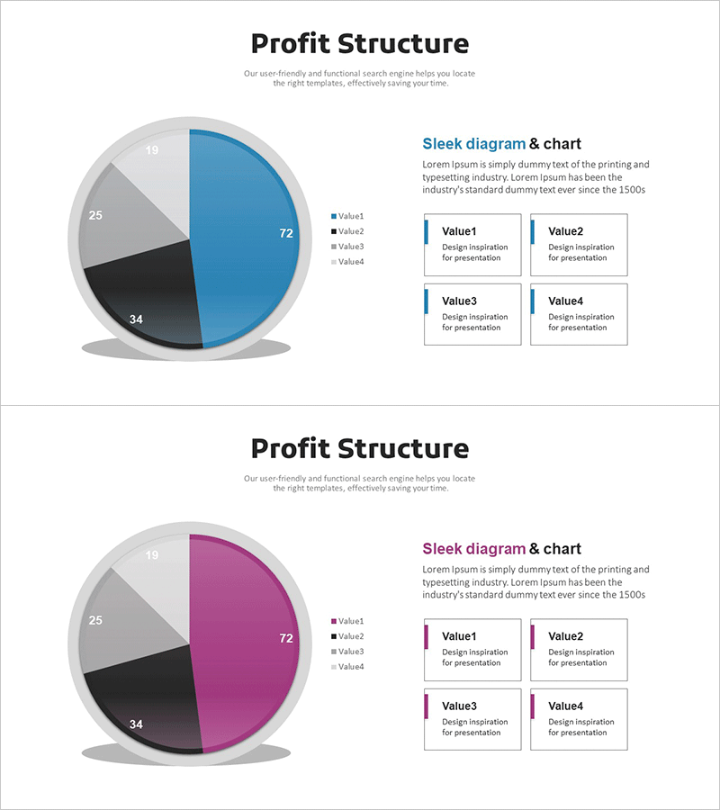
A PowerPoint slide featuring a 4-segment pie chart for visualizing revenue models and cost analysis. The design combines a multi-color pie chart in blue, black, and gray tones with four descriptive text boxes arranged in a 2×2 grid layout. Each segment clearly displays its proportion (72, 34, 25, 19), making it ideal for business presentations, financial reports, and investment pitches. The 2-slide set includes color variations—blue and magenta versions—allowing you to match your presentation's visual identity. Perfect for communicating revenue structures and cost breakdowns to stakeholders, investors, and executives.
Usage Points
-
Main Usage
Visualize corporate revenue structures and cost analysis using a 4-segment pie chart, enabling stakeholders to understand financial composition at a glance. The proportional representation combined with numerical values makes financial data clear and persuasive for investors, executives, and decision-makers.
-
How to Use
Use in business plans, investment pitch decks, financial reports, and management presentations to explain revenue sources and cost allocation. Edit the text boxes with item names and descriptions, and adjust the pie chart colors and values to match your actual financial data.
-
Recommended For
CFOs, finance managers, executives, business strategists, and investment professionals presenting financial analysis. Ideal for startup pitch presentations, corporate earnings reports, business performance reviews, and strategic planning meetings where revenue structure and cost analysis need clear visual communication.
-
Slide Structure
Both slides feature identical layouts: title area at top, 4-segment pie chart on the left (proportions 72, 34, 25, 19), and 2×2 grid of text input boxes on the right (Value1–Value4). Slide 1 uses blue color scheme; Slide 2 provides magenta variation for design flexibility.
Related Products
-

Clock Image Shape Diagram – Product Status Presentation
#Product/Service Introduction #Diagram #Graph
-

Profit Structure Pie Chart – Revenue Model Analysis
#Product/Service Introduction #Business Introduction #Graph
-

Business Profit Structure Layer Diagram – Visualization of Revenue Model
#Product/Service Introduction #Business Introduction #Diagram
-

Medical Business Profit Structure Analysis Pie Chart
#Product/Service Introduction #Business Introduction #Diagram
