User Analysis Radial Graph – Understanding and Analyzing Customers
RM0200009_15
- Last Update 02/03/2025
- File Size 0.6MB
- # of Slides 2
- File Format PPTX
- Slide Ratio 16:9
- Color
Keywords
- #Content-Based Slides
- #Design-Based Slides
- #Product/Service Introduction
- #Market and Competitor Analysis
- #Diagram
- #Graph
- #Development Status
- #Customer Analysis
- #Cluster
- #Other
- #Closed Cluster Diagram
- #Radar Chart Spider Chart
- #16:9
- #radial chart PowerPoint
- #customer analysis slide
- #data visualization template
- #5-item comparison chart
- #how to create radial diagram in PowerPoint
About the Product
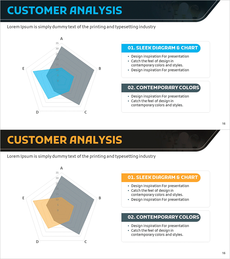
A 5-item radial chart PowerPoint slide designed for customer analysis and user understanding. The diagram features five axes radiating from a central core, enabling multi-dimensional data comparison at a glance. Cyan and orange color variants with gray background contrast highlight key data points effectively. Ideal for market analysis, customer segmentation, competitive benchmarking, and quantitative data presentations. Fully editable and ready to use in business reports, strategy meetings, and investor pitches.
Usage Points
-
Main Usage
Visualize multi-dimensional customer analysis, user metrics, and market data using a radial structure that intuitively compares relative sizes and relationships between five key items. Effectively emphasizes quantitative indicators and highlights strategic insights.
-
How to Use
Replace the five axis labels and values with your customer segments, competitive metrics, performance indicators, or market factors. Select the cyan or orange color variant matching your brand guidelines, then input data values for automatic chart updates.
-
Recommended For
Marketing managers, business analysts, product strategists, and sales executives presenting customer analysis results, market positioning, and competitive benchmarking. Suitable for investor presentations, strategic planning meetings, and client proposal decks.
-
Slide Structure
2-slide set. Slide 1: Cyan radial chart with 5 axes, central core element, and gray background contrast. Slide 2: Orange color variant with identical structure. Both slides include title, descriptive text, and legend for complete data context.
Related Products
-

3-Axis Radar Chart Analysis – Effective Data Visualization
#Product/Service Introduction #Marketing Plan and Strategy #Diagram
-

Customer Analysis Radial Graph – Intuitive Data Visualization
#Business Introduction #Market and Competitor Analysis #Diagram
-

Development Status Radial Graph – Clarifying Business Vision and Goals
#Product/Service Introduction #Business Vision and Strategy #Diagram
-

User Feedback Analysis – Visual Insights Centered on Customers
#Market and Competitor Analysis #Customer Success Stories #Diagram
