3-Axis Radar Chart Analysis – Effective Data Visualization
RJ0300043_30
- Last Update 04/29/2025
- File Size 2.9MB
- # of Slides 2
- File Format PPTX
- Slide Ratio 16:9
- Color
Keywords
- #Content-Based Slides
- #Design-Based Slides
- #Product/Service Introduction
- #Marketing Plan and Strategy
- #Diagram
- #Graph
- #Development Status
- #Marketing Objectives
- #Cluster
- #Other
- #Closed Cluster Diagram
- #Radar Chart Spider Chart
- #16:9
- #radar chart PowerPoint
- #6-axis radial chart template
- #data visualization slides
- #business analysis presentation
- #multidimensional data comparison
About the Product
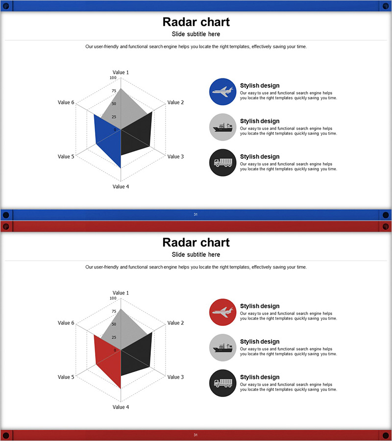
A PowerPoint slide template featuring a 6-axis radial chart that visualizes multidimensional data with dual-series comparison. The design uses contrasting blue and red color schemes to represent two datasets simultaneously, with a gray reference area that clearly indicates baseline values. Ideal for marketing performance analysis, competitive product assessment, organizational capability evaluation, and strategic benchmarking presentations. The template includes 2 slide variations with color alternations, optimized for 16:9 widescreen format and fully editable in PPTX.
Usage Points
-
Main Usage
Compare relative strengths and weaknesses across six dimensions in a single visual. Commonly used for marketing metrics (awareness, preference, purchase intent, satisfaction, retention, advocacy), product competitiveness (features, price, quality, design, service, reliability), and organizational capabilities (strategy, execution, innovation, customer satisfaction, finance, talent).
-
How to Use
Enter evaluation criteria labels on each axis. Input your organization's data in the blue series and competitor or target values in the red series. Normalize all values to a 0-100 scale for clear visual comparison. Insert into presentations, reports, proposals, and strategic briefings to support data-driven decision-making.
-
Recommended For
Marketing managers, strategy planners, business analysts, C-suite executives, product development teams, consulting firms, and educational institutions. Suitable for any presentation requiring quantitative multi-factor comparison.
-
Slide Structure
Two 6-axis radial chart variations with blue and red emphasis respectively. Each slide includes three circular icon callout areas for supplementary insights. Gray reference bands and dotted gridlines enhance data readability and axis clarity.
Related Products
-

User Analysis Radial Graph – Understanding and Analyzing Customers
#Product/Service Introduction #Market and Competitor Analysis #Diagram
-

Development Status Radial Graph – Clarifying Business Vision and Goals
#Product/Service Introduction #Business Vision and Strategy #Diagram
-

Marketing Core Objectives Diagram - Strategic Goal Setting
#Business Vision and Strategy #Marketing Plan and Strategy #Diagram
-

Diagram Slide for Smart Network Business Goals
#Business Vision and Strategy #Marketing Plan and Strategy #Diagram
