Graph of User Status Analysis by Age Group
RM0100019_13
- Last Update 01/31/2025
- File Size 0.9MB
- # of Slides 2
- File Format PPTX
- Slide Ratio 16:9
- Color
Keywords
- #Content-Based Slides
- #Design-Based Slides
- #Market and Competitor Analysis
- #Diagram
- #Graph
- #Market Status
- #Customer Analysis
- #Cluster
- #Circles
- #Closed Cluster Diagram
- #Doughnut Chart
- #16:9
- #donut chart PowerPoint slide
- #age group user analysis
- #pie chart template
- #customer analysis graph
- #market segmentation PPT
- #how to create donut chart in PowerPoint
About the Product
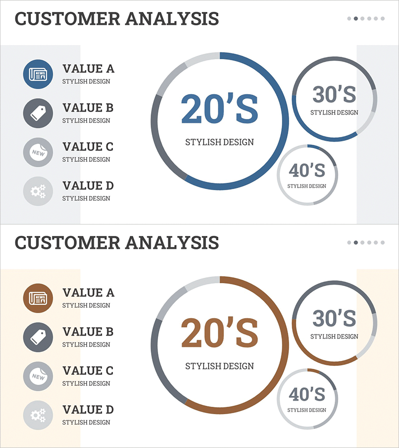
A donut-shaped pie chart PowerPoint slide that visualizes user status analysis by age group. The design displays three age segments (20s, 30s, 40s) with a central large circle and two smaller circles on the right, using navy blue for primary segments and light gray for secondary segments. The left side features an icon-based legend (VALUE A–D), while the right side shows the donut chart layout for clear information hierarchy. Ideal for customer analysis, market research, and marketing strategy presentations. Two-slide set includes color variations (blue and brown tones) for flexible presentation styling.
Usage Points
-
Main Usage
Visualize customer age distribution, market segmentation, and user demographics at a glance using a donut-shaped pie chart. The central large circle paired with smaller circles on the right creates a hierarchical representation of primary and secondary age segments, optimized for ratio-based data visualization.
-
How to Use
Use this slide during marketing strategy development, customer analysis reports, and market research presentations to explain age-based user distribution. Replace VALUE A–D legend text with actual age group names and update the donut chart percentages to match your data. Choose between blue or brown color variants depending on your presentation background and corporate branding.
-
Recommended For
Marketing teams, sales departments, executives, and market research professionals analyzing customer profiles and age-based segmentation. Particularly useful for B2C companies defining target demographics, identifying primary customer segments, and planning age-focused advertising campaigns.
-
Slide Structure
Slide 1: Navy blue donut chart with central large circle (20s segment) and two smaller circles (30s and 40s) on the right, bordered by gray outlines. Left side shows four-icon legend. Slide 2: Identical layout in brown tone. Central text areas allow input of age group names and percentage values.
Related Products
-

Market Share Analysis Graph by Technology – Competition and Collaboration
#Market and Competitor Analysis #Diagram #Graph
-

Clothing Site Customer Analysis Graph – Business Growth Through Customer Insights
#Market and Competitor Analysis #Diagram #Graph
-

Market Status Donut Pie Chart – Intuitive Data Visualization
#Market and Competitor Analysis #Diagram #Graph
-

SUV Percentage Donut Graph – Market Status Analysis
#Market and Competitor Analysis #Diagram #Graph
