Clothing Site Customer Analysis Graph – Business Growth Through Customer Insights
RM0100015_13
- Last Update 01/29/2025
- File Size 3.6MB
- # of Slides 2
- File Format PPTX
- Slide Ratio 16:9
- Color
Keywords
- #Content-Based Slides
- #Design-Based Slides
- #Market and Competitor Analysis
- #Diagram
- #Graph
- #Market Status
- #Customer Analysis
- #Cluster
- #Column
- #Closed Cluster Diagram
- #Grouped Column
- #16:9
- #grouped bar chart PowerPoint
- #customer analysis slide template
- #multi-series data comparison
- #clothing site analytics presentation
- #how to create grouped bar chart in PowerPoint
About the Product
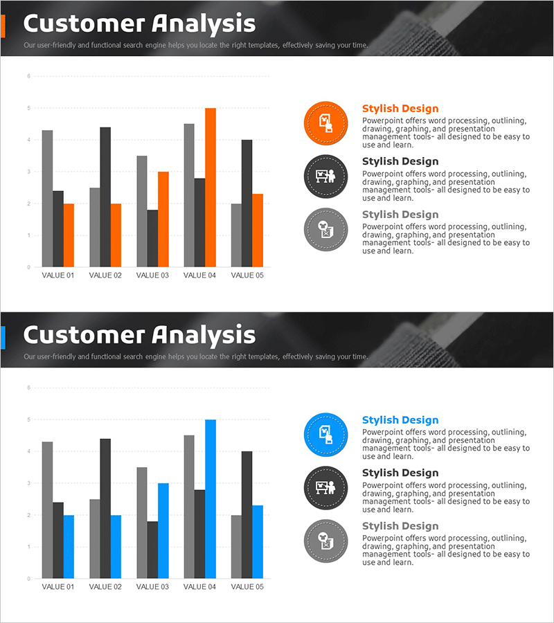
A grouped bar chart PowerPoint slide designed for clothing site customer analysis. This presentation template visualizes multiple data series across five items using gray, orange, and blue color coding to compare customer segments, purchase frequency, satisfaction scores, and other key metrics simultaneously. The 16:9 widescreen format includes 2 slides, each featuring a graph on the left with three icon-based text boxes on the right to highlight core insights. Ready to use in business reports, presentations, and strategic planning documents.
Usage Points
-
Main Usage
Enables simultaneous comparison of multiple customer metrics including purchase patterns, visit frequency, satisfaction ratings, and repeat purchase rates across different segments. Ideal for e-commerce and retail platforms to support data-driven decision-making in customer insights analysis and business growth strategy development.
-
How to Use
Input actual numerical values into each VALUE field and the bar heights adjust automatically. Add key interpretations and action points to the icon-based text boxes on the right to connect graph data with strategic insights. Display slides sequentially or select individual slides as needed for your presentation flow.
-
Recommended For
Recommended for e-commerce and apparel company marketing and planning teams presenting customer analysis reports, quarterly or annual performance reviews to executives, investor presentations on customer-driven growth strategies, and team meetings on customer segmentation analysis.
-
Slide Structure
Both slides share identical layout: grouped bar chart on the left with 5 items (VALUE 01–05) and 3 data series (gray, orange, blue bars), and 3 circular icons with accompanying text areas on the right. Each item displays 3 bars side-by-side representing the three data series.
Related Products
-

User Status Analysis Graph – Market Analysis and Customer Insights
#Market and Competitor Analysis #Diagram #Graph
-

Graph of User Status Analysis by Age Group
#Market and Competitor Analysis #Diagram #Graph
-

Customer Analysis Chart – Effective Market Insights
#Market and Competitor Analysis #Diagram #Graph
-

Challenges to Improve Korea's Image Slide – Analysis by Age
#Market and Competitor Analysis #Diagram #Graph
