Customer Analysis Chart – Effective Market Insights
RM0100014_13
- Last Update 01/29/2025
- File Size 0.3MB
- # of Slides 2
- File Format PPTX
- Slide Ratio 16:9
- Color
Keywords
- #Content-Based Slides
- #Design-Based Slides
- #Market and Competitor Analysis
- #Diagram
- #Graph
- #Market Status
- #Customer Analysis
- #Table
- #Column
- #Grouped Column
- #16:9
- #grouped bar chart PowerPoint
- #multi-series chart slide template
- #customer analysis graph
- #market research data visualization
- #how to create grouped bar chart in PowerPoint
About the Product
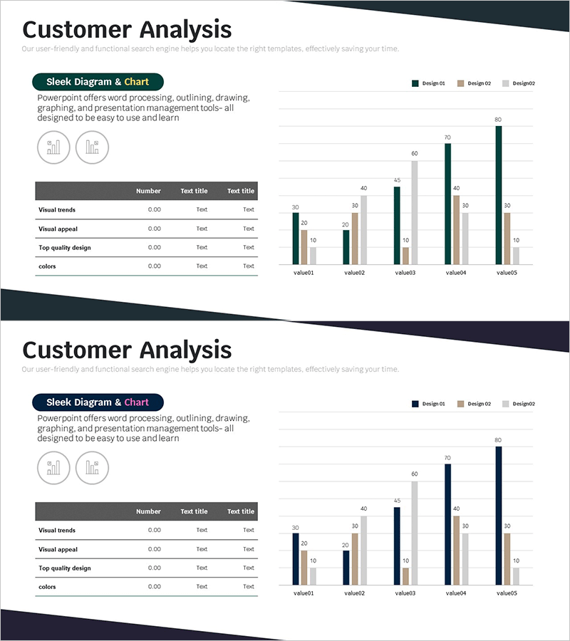
A grouped bar chart PowerPoint slide designed for customer analysis and market research data visualization. The vertical bar chart displays five data items (value01 through value05) across three color-coded series—dark green, beige, and light gray—enabling clear numerical comparison. Includes an integrated data table section and icon elements for comprehensive information presentation. Ideal for customer segmentation analysis, market trend reporting, sales performance review, and competitive benchmarking. The 16:9 widescreen format with two-slide layout provides flexibility for editing and presentation flow customization.
Usage Points
-
Main Usage
Compare multiple data series across customer segments, market trends, sales metrics, and competitive analysis. The grouped bar structure enables intuitive side-by-side comparison of values, while the integrated data table provides detailed figures and analytical context for comprehensive insights.
-
How to Use
Position in market analysis, customer analysis, or performance reporting sections of presentations. Use bar heights and color differentiation to highlight series variations, and supplement visual data with verbal explanation of table figures to enhance audience comprehension and engagement.
-
Recommended For
Marketing, sales, and business planning presentations; executive performance reports; investor pitch decks; market research findings; quarterly and annual results analysis. Suitable for any data-driven business presentation requiring multi-series numerical comparison.
-
Slide Structure
Vertical grouped bar chart (5 items × 3 series), legend (Design01, Design02, Design03), data table (Number column, Test title columns × 4 rows), 2 icon elements. Dark green, beige, and light gray color scheme clearly distinguishes data series.
Related Products
-

Touch Wide Slide Template – Column Chart & Table
#Market and Competitor Analysis #Diagram #Graph
-

User Rating Analysis Chart – Visualizing Customer Insights
#Market and Competitor Analysis #Diagram #Graph
-

User Status Analysis Graph – Market Analysis and Customer Insights
#Market and Competitor Analysis #Diagram #Graph
-

Trends in Youth Reading in Autumn
#Market and Competitor Analysis #Diagram #Market Status
