User Status Analysis Graph – Market Analysis and Customer Insights
RM0100017_13
- Last Update 08/30/2025
- File Size 0.3MB
- # of Slides 2
- File Format PPTX
- Slide Ratio 16:9
- Color
Keywords
- #Content-Based Slides
- #Design-Based Slides
- #Market and Competitor Analysis
- #Diagram
- #Graph
- #Market Status
- #Customer Analysis
- #Cluster
- #Column
- #Closed Cluster Diagram
- #Grouped Column
- #16:9
- #horizontal bar chart PowerPoint
- #customer analysis slide template
- #data visualization presentation
- #market analysis graph
- #how to create bar chart in PowerPoint
About the Product
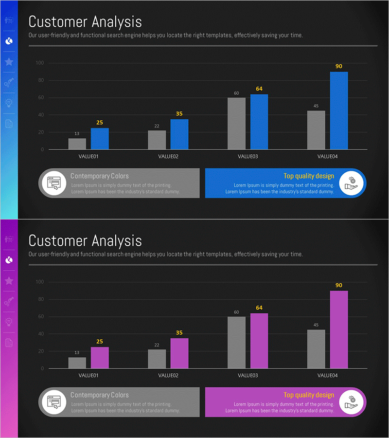
A horizontal bar chart PowerPoint slide designed to clearly present user status and customer insights across four categories. This presentation template features two color scheme options—gray with blue accents and gray with magenta accents—displayed on a dark background with precise numerical labels. Ideal for market analysis, customer segmentation, sales performance comparison, and data-driven business presentations. Provided in 16:9 widescreen PPTX format for immediate use.
Usage Points
-
Main Usage
Visualize numerical comparison across four data categories such as customer segments, market metrics, or sales performance. The horizontal bar format enables intuitive side-by-side comparison, while numerical labels provide precise values for stakeholder communication.
-
How to Use
Select between two color schemes (blue or magenta) to match your corporate branding. Input your data values and the bars automatically scale proportionally. Customize category names and numerical labels to align with your presentation content and business context.
-
Recommended For
Marketing professionals presenting customer segmentation analysis, sales teams comparing performance metrics, executives reporting market conditions, and consultants developing data-driven business proposals.
-
Slide Structure
Two-slide set: Slide 1 features a blue-toned horizontal bar chart with four categories (values: 13, 25, 22, 35); Slide 2 displays the same structure in magenta tones with extended data points (13, 25, 22, 35, 60, 64, 45, 90). Both slides include icon and descriptive text areas at the bottom.
Related Products
-

Clothing Site Customer Analysis Graph – Business Growth Through Customer Insights
#Market and Competitor Analysis #Diagram #Graph
-

Customer Analysis Chart – Effective Market Insights
#Market and Competitor Analysis #Diagram #Graph
-

Challenges to Improve Korea's Image Slide – Analysis by Age
#Market and Competitor Analysis #Diagram #Graph
-

Graph of User Status Analysis by Age Group
#Market and Competitor Analysis #Diagram #Graph
