Pricing Strategy Step-by-Step Diagram
RM0100004_28
- Last Update 01/25/2025
- File Size 4.1MB
- # of Slides 4
- File Format PPTX
- Slide Ratio 16:9
- Color
Keywords
- #Content-Based Slides
- #Design-Based Slides
- #Business Strategy
- #Marketing Plan and Strategy
- #Diagram
- #Step-by-Step Schedule Plan
- #Pricing Strategy
- #Flow
- #Table
- #Linear Flow
- #16:9
- #4-step diagram PowerPoint
- #linear process flow slide
- #pricing strategy diagram
- #step-by-step flowchart PPT
- #marketing strategy presentation slide
About the Product
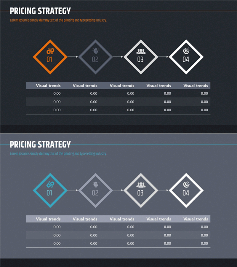
A PowerPoint slide that visualizes the pricing strategy process in four sequential steps, ideal for marketing presentations and business strategy discussions. The diagram features four connected nodes flowing from left to right, with the first node highlighted in orange and the remaining nodes in gray and white tones. Each node contains an icon representing a distinct phase of the pricing decision process, connected by directional arrows that emphasize workflow progression. The lower section includes a data input area with five columns where you can add numerical metrics, market analysis results, or financial projections for each stage. Provided in 16:9 PPTX format, this slide is fully editable and ready for immediate use in your presentations.
Usage Points
-
Main Usage
Breaks down complex pricing strategy into four logical stages, helping audiences understand the decision-making framework. Each stage is represented by an icon, making abstract pricing concepts tangible and easier to follow during executive presentations or strategy meetings.
-
How to Use
Open the slide and customize each node's icon and label to match your specific pricing strategy stages. Fill the data input area below with market research figures, competitor analysis, target margins, or cost breakdowns. Present each stage sequentially, using the visual flow to guide your audience through the pricing logic.
-
Recommended For
Marketing managers, product planning teams, sales strategy professionals, and executives preparing pricing policy presentations. Suitable for new product launch announcements, price adjustment communications, market entry strategies, and board-level financial planning discussions.
-
Slide Structure
Four diagram nodes connected left-to-right with directional arrows in a linear flow. The first node is highlighted in orange; subsequent nodes use gray and white color schemes. Each node contains one icon; below the diagram is a data table with five columns and three rows for entering metrics, labeled 'Visual trends' for each column.
Related Products
-

Step-by-step Pricing Strategy Diagram
#Business Strategy #Marketing Plan and Strategy #Diagram
-

Pricing Strategy Flow Diagram
#Business Strategy #Marketing Plan and Strategy #Diagram
-

Step-by-Step Pricing Strategy Presentation Slide
#Business Strategy #Marketing Plan and Strategy #Diagram
-

Setting a Sales Pricing Strategy – Effective Business Management
#Business Strategy #Marketing Plan and Strategy #Diagram
