Performance Metrics Dashboard Slide for Presentation Results
RJ0800056_8
- Last Update 12/22/2025
- File Size 2MB
- # of Slides 2
- File Format PPTX
- Slide Ratio 16:9
- Color
Keywords
- #Content-Based Slides
- #Design-Based Slides
- #Product/Service Introduction
- #Graph
- #Composition
- #Horizontal Bar
- #Circles
- #Horizontal Bar Chart
- #Doughnut Chart
- #16:9
- #donut chart PowerPoint slide
- #performance metrics dashboard template
- #mixed graph presentation
- #KPI visualization PPT
- #process flow diagram
- #how to create donut chart in PowerPoint
About the Product
A 2-slide PowerPoint presentation visualizing orbital alignment processes and performance metrics. Combines two donut charts with a horizontal bar graph and linear process flow diagram to display alignment status over time and current mission metrics simultaneously. Features a black background with orange accent colors to highlight data points, optimized for 16:9 widescreen format. Ready to use for operational reports, technical performance presentations, KPI analysis, and executive briefings.
Usage Points
-
Main Usage
Designed to present organizational performance metrics and alignment status at a glance. Donut charts represent proportional data, horizontal bar graphs compare numerical values across categories, and a linear process flow diagram illustrates step-by-step progression.
-
How to Use
First slide explains the process stages from signal acquisition through alignment confirmation. Second slide presents alignment level changes over time and current mission alignment status using numerical data and visual charts. Black background ensures clear visibility in projection environments.
-
Recommended For
Ideal for operational reports, technical performance presentations, quarterly performance analysis, project status updates, executive KPI briefings, and data-driven decision-making meetings. Particularly suited for aerospace, satellite operations, and technical projects requiring explanation of complex processes alongside quantitative results.
-
Slide Structure
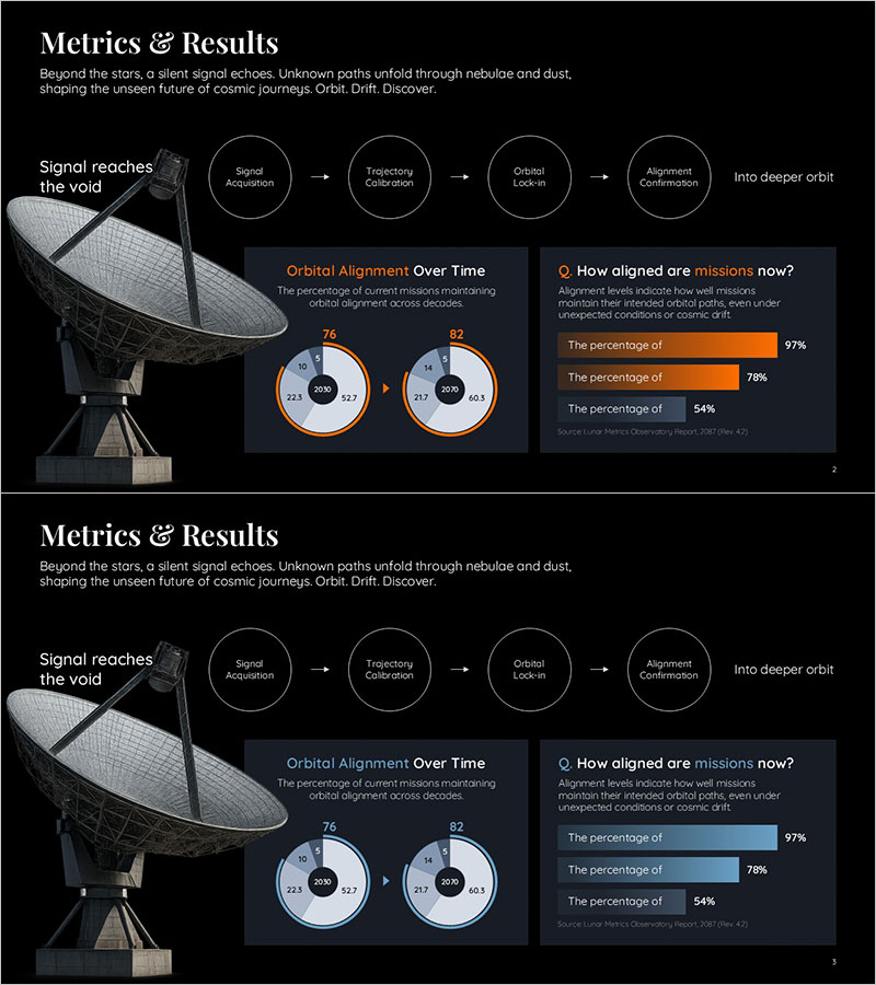
Slide 1: Five-stage linear process flow (Signal Acquisition → Trajectory Calibration → Orbital Lock-in → Alignment Confirmation) with connecting arrows. Slide 2: Left side features two donut charts showing time-series data (76%, 82%), right side displays three-item horizontal bar graph showing current mission alignment percentages (97%, 78%, 54%).
Related Products
-

Rocket Research Progress Pie Chart – Market and Service Analysis
#Product/Service Introduction #Market and Competitor Analysis #Graph
-

Idea Development Status Graph – Clear Data Visualization with Doughnut Chart
#Product/Service Introduction #Market and Competitor Analysis #Graph
-

Medical System Configuration Graph – Infographic for Market Analysis
#Product/Service Introduction #Market and Competitor Analysis #Diagram
-

Market Share Status of Premium Cafe Industry
#Market and Competitor Analysis #Graph #Market Status
