Aerospace Industry Technology Status Graph – Market Dominance Data Analysis
RJ0700020_5
- Last Update 07/28/2025
- File Size 1.1MB
- # of Slides 2
- File Format PPTX
- Slide Ratio 16:9
- Color
Keywords
- #Content-Based Slides
- #Design-Based Slides
- #Product/Service Introduction
- #Market and Competitor Analysis
- #Graph
- #Composition
- #Market Analysis
- #Circles
- #Doughnut Chart
- #16:9
- #donut chart PowerPoint slide
- #pie chart presentation template
- #ratio data visualization
- #data analysis slide
- #how to create pie chart in PowerPoint
- #percentage breakdown slide template
About the Product
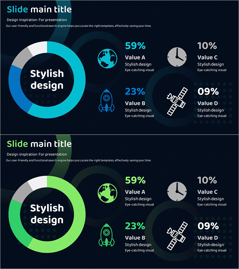
A 2-slide PowerPoint presentation featuring donut-shaped pie charts in cyan and green tones on a dark background. The design places a core message at the center while displaying four data segments with percentage values around the perimeter, accompanied by icons and descriptive text. This structure is optimized for presenting market share, technology composition, resource allocation, and industry analysis. The slides are in 16:9 widescreen PPTX format, fully editable and ready for immediate use in business presentations, technical briefings, and market analysis reports.
Usage Points
-
Main Usage
Visualize and compare ratio-based data such as market dominance, technology composition, resource distribution, and cost structure. The donut center emphasizes the core message while surrounding segments display percentage values, enhancing audience comprehension of proportional relationships.
-
How to Use
Deploy during technology status, market analysis, or industry trend presentations when explaining ratio-based data. Customize by entering your own percentages, replacing icons, and adjusting colors to match your presentation theme. Suitable for executive briefings, investor presentations, and academic conferences.
-
Recommended For
Marketing professionals, technical experts, and executives in aerospace, IT, manufacturing, finance, and energy sectors. Recommended for those presenting market analysis, competitive comparisons, technology roadmaps, and resource allocation strategies.
-
Slide Structure
Slide 1: Cyan donut chart (59% Value A, 23% Value B, 10% Value C, 09% Value D) with center text, right-aligned icons, percentages, and descriptions. Slide 2: Identical layout in green tone. Both slides feature 16:9 widescreen format with dark background and high-contrast light text for readability.
Related Products
-

Comparative Analysis of Composition Contents Pie Chart – Market and Competitor Analysis
#Product/Service Introduction #Market and Competitor Analysis #Graph
-

Conveying Design Inspiration with Circular Diagram – Visually Appealing Presentation
#Product/Service Introduction #Market and Competitor Analysis #Graph
-

Donut Slide Visualizing COVID-19 Virus Types
#Product/Service Introduction #Market and Competitor Analysis #Graph
-

Oriental Medicine Component Circle Graph – Accurate Visualization of Market and Products
#Product/Service Introduction #Market and Competitor Analysis #Graph
