Competitive Advantage Line Graph by Year – Market Analysis Tool
RJ0500010_20
- Last Update 08/27/2025
- File Size 0.3MB
- # of Slides 2
- File Format PPTX
- Slide Ratio 16:9
- Color
Keywords
About the Product
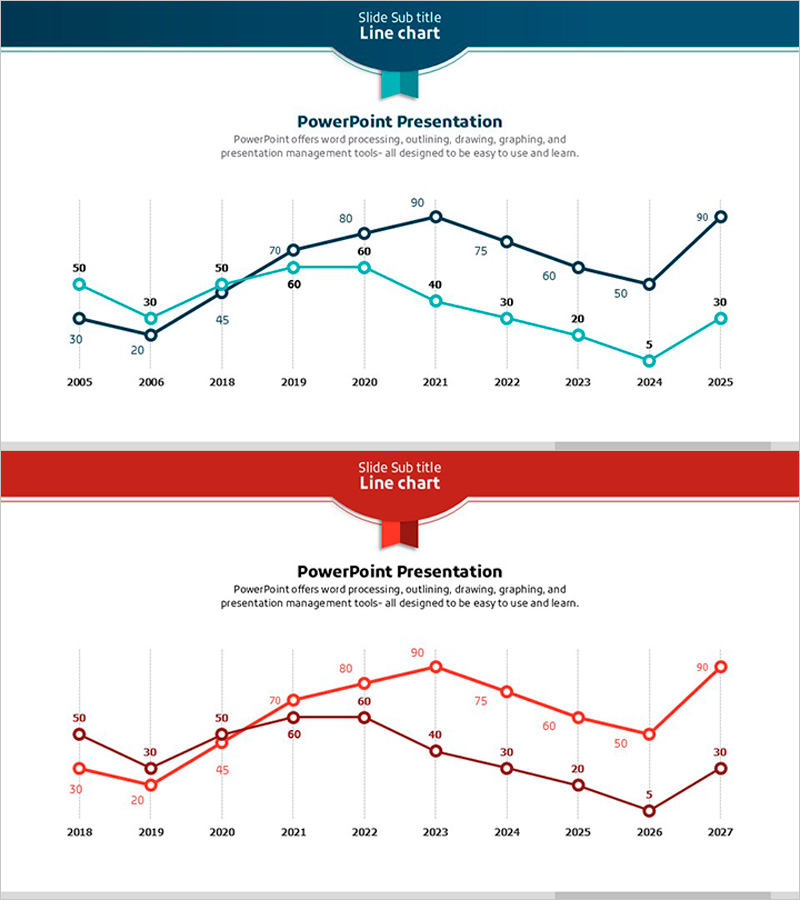
A multi-series line chart PowerPoint slide that visualizes data changes across time periods using two distinct data lines. The chart features navy and teal colored lines in the upper slide, and red and pink lines in the lower slide, each representing different metrics or competitive benchmarks. Grid background and labeled data points enable precise value reading. Ideal for business presentations including market analysis, competitive benchmarking, performance reporting, and trend forecasting. The 16:9 widescreen format with 2 slides is ready for immediate customization and integration into your presentation deck.
Usage Points
-
Main Usage
Compare how two or more metrics evolve over time to identify patterns and correlations. Effectively communicate competitive advantage shifts, market share trends, revenue versus cost analysis, customer satisfaction changes, and other multi-variable performance indicators to stakeholders and decision-makers.
-
How to Use
Open the slide and replace the sample data points with your actual figures. Update axis labels, legend text, and slide title to match your presentation context. Adjust line colors if needed to align with corporate branding guidelines. Retain grid lines and data point markers for optimal readability and professional appearance.
-
Recommended For
Marketing managers, financial analysts, strategy planners, sales directors, management consultants, and business intelligence professionals. Particularly valuable for executive briefings, quarterly business reviews, investor presentations, and strategic planning sessions where multi-metric trend comparison is essential.
-
Slide Structure
2-slide set. Upper slide displays dual navy and teal lines tracking data from 2005-2025 with 10 data points each. Lower slide shows dual red and pink lines for 2018-2027 period. Both slides include gridlines, labeled data points, legend, and value annotations for clear data interpretation.
Related Products
-

Comparative Analysis Line Graph – Market & Competitor Analysis
#Market and Competitor Analysis #Graph #Competitor Analysis
-

Brown Blue Detailed Analysis Chart - Market and Competitor Analysis
#Market and Competitor Analysis #Diagram #Graph
-

Graph Analysis by Year Sales
#Market and Competitor Analysis #Financial Plans and Performance #Graph
-

Social Network Wide Template Line Chart - Market Competition Analysis
#Business Strategy #Market and Competitor Analysis #Graph
