Sales Rate by Product Recently – Market Competition Analysis
RJ0900025_17
- Last Update 08/23/2025
- File Size 0.5MB
- # of Slides 2
- File Format PPTX
- Slide Ratio 16:9
- Color
Keywords
- #Content-Based Slides
- #Design-Based Slides
- #Market and Competitor Analysis
- #Financial Plans and Performance
- #Diagram
- #Market Analysis
- #Sales and Revenue
- #Cluster
- #Closed Cluster Diagram
- #16:9
- #closed box diagram PowerPoint
- #sales rate visualization slide
- #5-item comparison chart
- #market analysis PPT template
- #competitive analysis presentation
About the Product
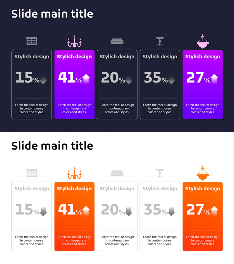
A PowerPoint slide that visualizes sales rates, market share, and competitive comparison across five items using a closed-box diagram structure. Set against a dark navy background with magenta and orange accent colors to highlight key metrics, each box displays percentage values and icons. Composed of 2 slides optimized for 16:9 widescreen format. Ready to use for financial performance reports, market analysis presentations, and competitive benchmarking slides.
Usage Points
-
Main Usage
Visualize and compare sales rates, market share, or performance metrics across five product lines, departments, or competitors. Each box displays percentage data with visual emphasis on top performers through color coding, enabling stakeholders to quickly assess relative performance.
-
How to Use
Insert this slide into financial reports, quarterly sales analysis, or competitive landscape presentations. Edit percentage values and labels in each box to reflect actual data. Customize colors by category if needed to differentiate between product lines or business units.
-
Recommended For
Finance teams, marketing departments, executive presentations, quarterly and annual performance reviews, investor relations materials, and competitive benchmarking reports. Best suited for scenarios requiring quantitative comparison of five or fewer data points.
-
Slide Structure
Dark navy background with five closed boxes arranged horizontally. Each box contains an icon at the top, percentage value in the center, and descriptive text at the bottom. Two boxes (positions 2 and 5) are highlighted in magenta, three in orange, with arrow icons indicating upward or downward trends.
Related Products
-

Investment Competition Market Analysis Graph – Effective Market Evaluation
#Market and Competitor Analysis #Diagram #Graph
-

Business Analysis Bar Graph – Business Strategy and Market Analysis
#Business Vision and Strategy #Market and Competitor Analysis #Diagram
-

Simple Car Wide Presentation Vertical Bar Chart
#Market and Competitor Analysis #Financial Plans and Performance #Graph
-

Pie Chart of Shooting Status Analysis – Visual Insights
#Product/Service Introduction #Market and Competitor Analysis #Diagram
