Investment Competition Market Analysis Graph – Effective Market Evaluation
RJ0300096_9
- Last Update 05/16/2025
- File Size 0.3MB
- # of Slides 2
- File Format PPTX
- Slide Ratio 16:9
- Color
Keywords
- #Content-Based Slides
- #Design-Based Slides
- #Market and Competitor Analysis
- #Diagram
- #Graph
- #Other
- #Market Analysis
- #Cluster
- #Closed Cluster Diagram
- #16:9
- #clustered chart PowerPoint
- #investment market analysis graph
- #competitive analysis slide
- #bar line combination chart
- #dual-series data visualization
About the Product
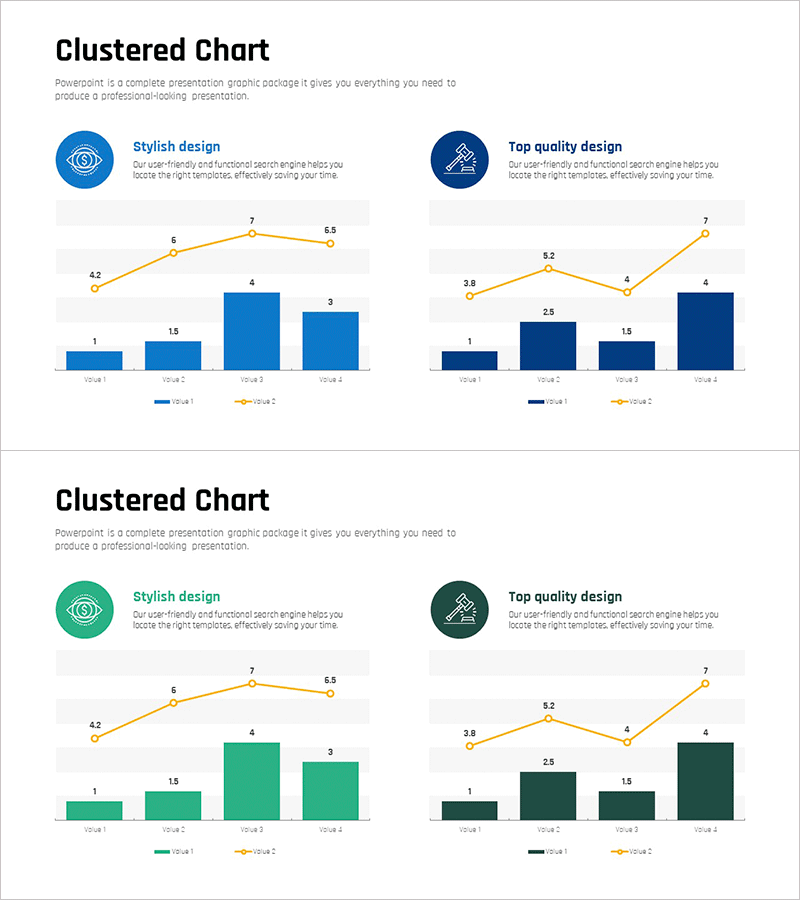
A clustered chart PowerPoint slide designed for investment competition market analysis. This presentation combines bar graphs and line charts in a dual-series data visualization to effectively represent market evaluation metrics. The blue and green two-tone color scheme clearly distinguishes between two data series, enabling comparison across four quarterly periods. Ideal for investment analysis, competitive research, and market trend presentations that require immediate deployment.
Usage Points
-
Main Usage
Optimized for visualizing investment market competition analysis and market evaluation metrics. The bar graph displays absolute values while the line chart shows trends simultaneously, making it highly effective for complex data comparison. Suitable for investment decision-making presentations.
-
How to Use
Insert into investment proposals, market analysis reports, or competitive analysis sections. Edit the numerical values in each category to input actual market data, and the blue-green two-tone color scheme automatically distinguishes the two series. During presentation, explain the correlation between bars and line trends.
-
Recommended For
Investment analysts, management consultants, marketing strategists, and business development professionals explaining market competition scenarios. Valuable for financial institutions, startup funding pitches, and corporate strategy meetings requiring data-driven decision support.
-
Slide Structure
Two-slide layout with each slide divided into left icon area (stylish design and top quality design indicators) and right chart area. Charts display four quarterly periods (Q1–Q4) with dual bar series (dark blue and light blue) and one line series (orange), with numerical labels at each data point.
Related Products
-

3 Radial Charts and Analysis – Competitor and Market Trends
#Market and Competitor Analysis #Diagram #Graph
-

Graph Slide for Market and Competitor Analysis – Online Market Overview
#Market and Competitor Analysis #Diagram #Graph
-

Botanic Garden and Bar Chart – Visualization for Market Analysis
#Market and Competitor Analysis #Diagram #Graph
-

Positioning Area Graph – Essential Slide for Market Analysis
#Market and Competitor Analysis #Marketing Plan and Strategy #Diagram
