Construction Development Status Chart – Key to Construction Market Analysis
RJ0900018_9
- Last Update 08/21/2025
- File Size 0.4MB
- # of Slides 2
- File Format PPTX
- Slide Ratio 16:9
- Color
Keywords
- #Content-Based Slides
- #Design-Based Slides
- #Product/Service Introduction
- #Market and Competitor Analysis
- #Graph
- #Development Status
- #Market Share
- #Circles
- #Pie Chart
- #16:9
- #pie chart PowerPoint slide
- #4-segment pie chart
- #construction market analysis
- #market share visualization
- #graph slide template
About the Product
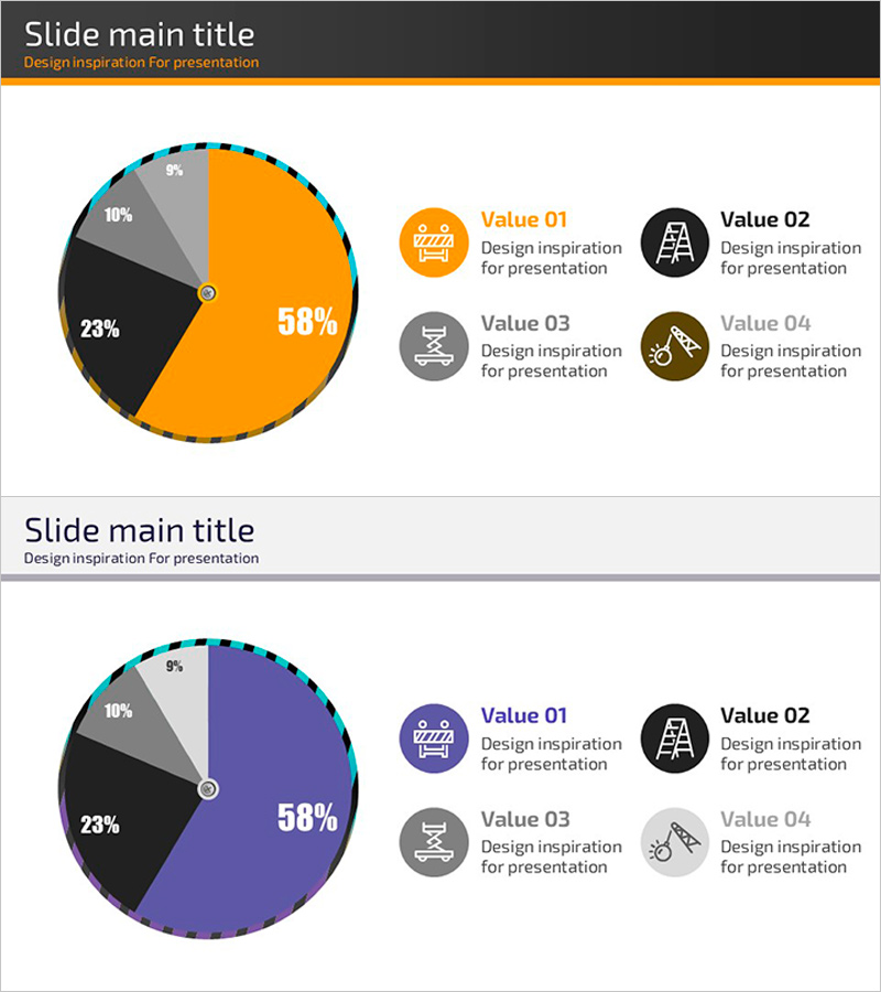
A 4-segment pie chart PowerPoint slide designed to visualize construction and development market share. The circular graph uses four distinct colors—orange, black, gray, and blue—to represent market segments with clear percentage labels (58%, 23%, 10%, 9%). An icon-based legend on the right side explains each category, making data interpretation intuitive. The 2-slide set offers two color variations (orange/black/gray/blue and purple/black/gray/light gray) to match your presentation's visual tone. Each slide includes a title area and structured layout for professional market analysis presentations. Ideal for construction companies, real estate developers, and project managers presenting market analysis, executive reports, and investor pitch decks.
Usage Points
-
Main Usage
Visualizes four-category market data such as market share, revenue composition, or customer distribution in the construction and real estate sectors. The pie chart clearly displays proportional relationships (58%, 23%, 10%, 9%) for executive reports, business analysis presentations, and investor relations materials.
-
How to Use
Replace the percentage values with your actual data and update the four legend items to match your categories. Choose between the orange or purple color scheme based on your presentation's design theme. Icons can be customized to represent each category's characteristics.
-
Recommended For
Construction companies, real estate developers, architectural firms, and project management teams preparing executive reports, market analysis documents, and investor pitch decks. Suitable for business presentations, consulting proposals, and industry analysis reports requiring quantitative data visualization.
-
Slide Structure
2-slide set with consistent layout. Each slide features a title area, a 4-segment pie chart in the center, and a 2×2 grid legend with icons on the right. The pie chart displays four segments with percentage labels (58%, 23%, 10%, 9%) clearly marked on each section.
Related Products
-

Pie Chart for Market Share Analysis – Effective Data Visualization
#Product/Service Introduction #Market and Competitor Analysis #Graph
-

4 Donut Charts for Data Visualization – Easy Presentation Template
#Product/Service Introduction #Market and Competitor Analysis #Graph
-

Development Status Pie Chart – Visualizing Product Progress
#Product/Service Introduction #Market and Competitor Analysis #Graph
-

Market Share Analysis Graph & Table – Enhancing Understanding through Data Visualization
#Product/Service Introduction #Market and Competitor Analysis #Diagram
