Brand Awareness Distribution Chart – Market Share Analysis
RJ0300044_27
- Last Update 04/30/2025
- File Size 0.2MB
- # of Slides 2
- File Format PPTX
- Slide Ratio 16:9
- Color
Keywords
- #Content-Based Slides
- #Design-Based Slides
- #Product/Service Introduction
- #Market and Competitor Analysis
- #Graph
- #Development Status
- #Market Share
- #Circles
- #Pie Chart
- #16:9
- #pie chart PowerPoint slide
- #circular graph presentation
- #ratio visualization chart
- #market analysis slide
- #brand awareness graph
- #pie chart template download
About the Product
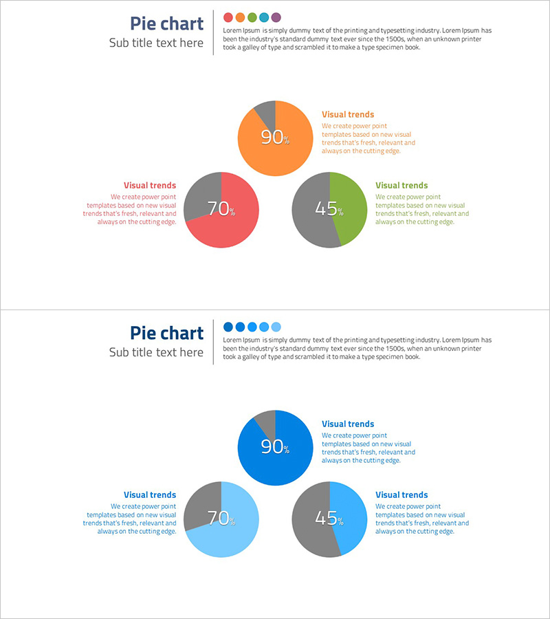
A pie chart PowerPoint slide that visualizes brand awareness and market share across three segments using contrasting colors: orange, red, and green. Each segment displays percentage values with accompanying legend text positioned to the right, enabling clear data interpretation. This presentation slide is ideal for marketing analysis, market research reports, and business presentations where composition ratios and market share need to be communicated effectively. The 2-slide set includes multiple color variations and is fully editable in PPTX format for immediate customization.
Usage Points
-
Main Usage
Visualize composition ratios such as brand awareness, market share, and customer satisfaction across three categories using a pie chart format. Supports data-driven decision-making in marketing analysis, market research, and executive reporting.
-
How to Use
Replace the displayed percentages (90%, 70%, 45%) with your actual data values and edit the legend text and descriptions to match your presentation context. Two color versions are provided—multi-color and monochromatic blue tones—allowing alignment with corporate brand guidelines.
-
Recommended For
Recommended for marketing team market analysis presentations, executive reports, business plan pitches, customer satisfaction survey results, and product market share analysis. Particularly effective when comparing three or more data segments.
-
Slide Structure
Each slide contains a title area, a 3-segment pie chart (3 nodes), percentage labels for each segment, and a legend text box positioned on the right. Both slides share the same layout structure with different color palettes (Version 1: orange, red, green / Version 2: blue gradient tones).
Related Products
-

Market Share Analysis Graph & Table – Enhancing Understanding through Data Visualization
#Product/Service Introduction #Market and Competitor Analysis #Diagram
-

Development Status Pie Chart – Efficient Data Delivery
#Product/Service Introduction #Market and Competitor Analysis #Graph
-

Pie Chart of the Development Status of the Snow Mountain Theme
#Product/Service Introduction #Market and Competitor Analysis #Diagram
-

Securities Business Analysis Circle Graph
#Product/Service Introduction #Market and Competitor Analysis #Graph
