



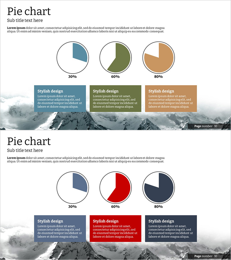
Pie Chart of the Development Status of the Snow Mountain Theme
RJ0300026_10
- Last Update 04/24/2025
- File Size 1.5MB
- # of Slides 2
- File Format PPTX
- Slide Ratio 16:9
- Color
Keywords
- #Content-Based Slides
- #Design-Based Slides
- #Product/Service Introduction
- #Market and Competitor Analysis
- #Diagram
- #Graph
- #Development Status
- #Market Share
- #Cluster
- #Circles
- #Closed Cluster Diagram
- #Pie Chart
- #16:9
- #pie chart PowerPoint slide
- #circular graph presentation template
- #data ratio comparison
- #3-segment pie chart
- #data visualization slides
About the Product
A minimalist pie chart PowerPoint slide featuring a snow mountain background for professional data visualization. This template displays three data segments with proportions at 30%, 60%, and 80% levels, each accompanied by descriptive text boxes below for clear data interpretation. The 2-slide set offers two distinct color schemes: warm tones (teal, olive, tan) on the first slide and high-contrast tones (navy, red, dark blue) on the second, adapting to various presentation contexts. Each pie chart includes a legend and explanation area, making it ideal for market share analysis, development progress tracking, budget allocation, and comparative ratio presentations.
Usage Points
-
Main Usage
This slide template visualizes ratio-based data using pie charts to enhance audience comprehension. It effectively displays three-item comparisons such as market share, budget distribution, development progress, and customer composition proportions in a single visual format.
-
How to Use
Modify each pie chart segment's color and percentage values to match your data, then input item names and descriptions in the text boxes below. The snow mountain background suits corporate reports, marketing presentations, and strategy meetings. Choose between the two color options based on your presentation tone and brand guidelines.
-
Recommended For
Financial analysts, marketing managers, business planners, consultants, and sales directors who need to present quantitative data persuasively. Ideal for quarterly performance reports, market analysis, portfolio composition explanations, and stakeholder briefings.
-
Slide Structure
2-slide set with three independent pie charts per slide. Each chart is divided into segments representing 30%, 60%, and 80% proportions. Below each chart are color-coded legend and three descriptive text boxes labeled 'Stylish design' arranged in left-to-right alignment for data explanation.
Related Products
-
Pie Chart for Workout Type Preferences – Market Status
#Market and Competitor Analysis #Diagram #Graph
-
Medical Development Status Pie Chart – Visualizing Market Share
#Product/Service Introduction #Market and Competitor Analysis #Graph
-
Blood Donation Status Analysis Pie Chart
#Product/Service Introduction #Market and Competitor Analysis #Graph
-
Water Drop Shape Graph – Visualizing Market Share
#Product/Service Introduction #Market and Competitor Analysis #Diagram