Tech Safety Curve Graph – The Power of Data Visualization
RJ0900018_25
- Last Update 08/21/2025
- File Size 0.4MB
- # of Slides 2
- File Format PPTX
- Slide Ratio 16:9
- Color
Keywords
About the Product
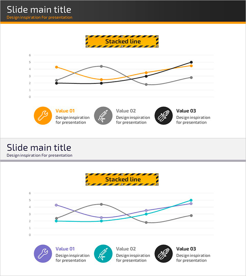
A multi-series line chart PowerPoint slide designed to visualize technology safety data trends across three independent metrics. The slide features three distinct data series in orange, gray, and black, intersecting across six data points to reveal performance changes over time. Each series is labeled with a circular icon (Value 01, 02, 03) at the bottom, providing intuitive identification of the metrics being tracked. The slide set includes two layouts with color variations—the first uses orange, gray, and black; the second features purple, teal, and black—allowing you to match your presentation theme. Both slides are formatted in 16:9 widescreen for modern presentation environments. Ideal for technical reports, safety performance reviews, and data-driven business presentations.
Usage Points
-
Main Usage
Designed to display technology safety indicators, performance metrics, and time-based trend comparisons. The three-series format allows simultaneous visualization of related data streams, making it easy to identify patterns, correlations, and divergences. Perfect for technical reports, safety performance presentations, and quarterly business reviews.
-
How to Use
Input your data values aligned with the Y-axis scale (0–6) to automatically generate the line chart. Replace the generic 'Value 01, 02, 03' labels and icons with your actual metric names. Use the color-variant slide to match your corporate branding or presentation color scheme. Both slides maintain identical structure for consistency.
-
Recommended For
Technology managers, safety officers, data analysts, and business executives presenting performance metrics. Ideal for IT, manufacturing, energy, and financial sectors where continuous monitoring of technical indicators is critical. Suitable for quarterly reviews, annual reports, and stakeholder presentations.
-
Slide Structure
Each slide contains a title area at the top, a central grid with Y-axis (0–6) and X-axis, three intersecting line series with six data points each, and a legend area at the bottom with three circular icons. Lines are color-coded (orange/gray/black or purple/teal/black) with circular markers at each data point. Both slides share identical structure with different color palettes.
Related Products
-

Business Technology Status Bar Graph – Insights Delivered Through Data Visualization
#Product/Service Introduction #Business Introduction #Graph
-

Current Status of Global Target Market Analysis – Strategic Insights through Data Visualization
#Company Introduction #Marketing Plan and Strategy #Graph
-

User Gender Ratio Analysis Graph – Customer Insights
#Market and Competitor Analysis #Graph #Customer Analysis
-

Horizontal Bar Graph for Competitor Analysis – Effective Data Visualization
#Market and Competitor Analysis #Graph #Competitor Analysis
