Performance Graphs of 3 Topics – Visual Icon of Data Representation
RJ0300027_31
- Last Update 04/25/2025
- File Size 0.5MB
- # of Slides 2
- File Format PPTX
- Slide Ratio 16:9
- Color
Keywords
About the Product
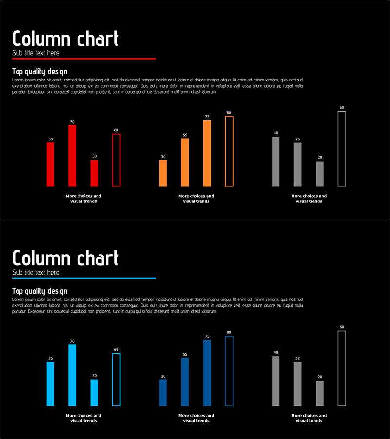
A 2-slide PowerPoint set visualizing performance data across 3 topics using column charts. Each chart displays 4–5 items per topic in distinct color series: red, orange, and gray. The slide layout includes a title and descriptive text area at the top, with each chart labeled 'More choices and visual trends' below. This presentation design effectively communicates performance analysis, comparative results, and departmental metrics in business reports and presentations. The 16:9 widescreen PPTX format is fully editable and ready to customize with your data.
Usage Points
-
Main Usage
Compares performance metrics across 3 topics or departments using column charts. Each topic displays 4–5 data points simultaneously, enabling quick assessment of performance status, results comparison, and goal achievement. Color-coded series distinguish data by topic for clarity.
-
How to Use
Use in business reports, performance presentations, and results analysis meetings to visualize departmental, product, or regional performance data. Enter your analysis topic in the title and description area, then update chart values with actual data. Maintain the color series by topic to ensure consistent presentation branding.
-
Recommended For
Ideal for executives, managers, marketing teams, sales teams, finance teams, and HR professionals requiring performance analysis and results reporting. Suitable for quarterly or annual performance reviews, inter-departmental comparisons, product sales tracking, and regional performance analysis.
-
Slide Structure
2-slide composition with 3 column charts per slide, each displaying 4–5 data items. Slide 1 uses red color series, Slide 2 uses orange series, and Slide 3 uses gray series. Title and subtitle text areas positioned at top; chart labels at bottom. Clean grid layout with clear axis labels and value indicators.
Related Products
-

Comparison of Traditional Business Sales – Performance and Competitive Advantage Analysis
#Business Strategy #Market and Competitor Analysis #Graph
-

Chart of Change in Sales by Country – Market Analysis and Competitive Advantage
#Market and Competitor Analysis #Graph #Other
-

Traffic Accident Cause Pie Chart
#Market and Competitor Analysis #Graph #Market Status
-

User Analysis Graph by Age Group – Advanced Data Insights
#Market and Competitor Analysis #Diagram #Graph
