Orange Purple Comparative Chart – Effective Data Visualization
RJ0900018_16
- Last Update 08/21/2025
- File Size 0.4MB
- # of Slides 2
- File Format PPTX
- Slide Ratio 16:9
- Color
Keywords
About the Product
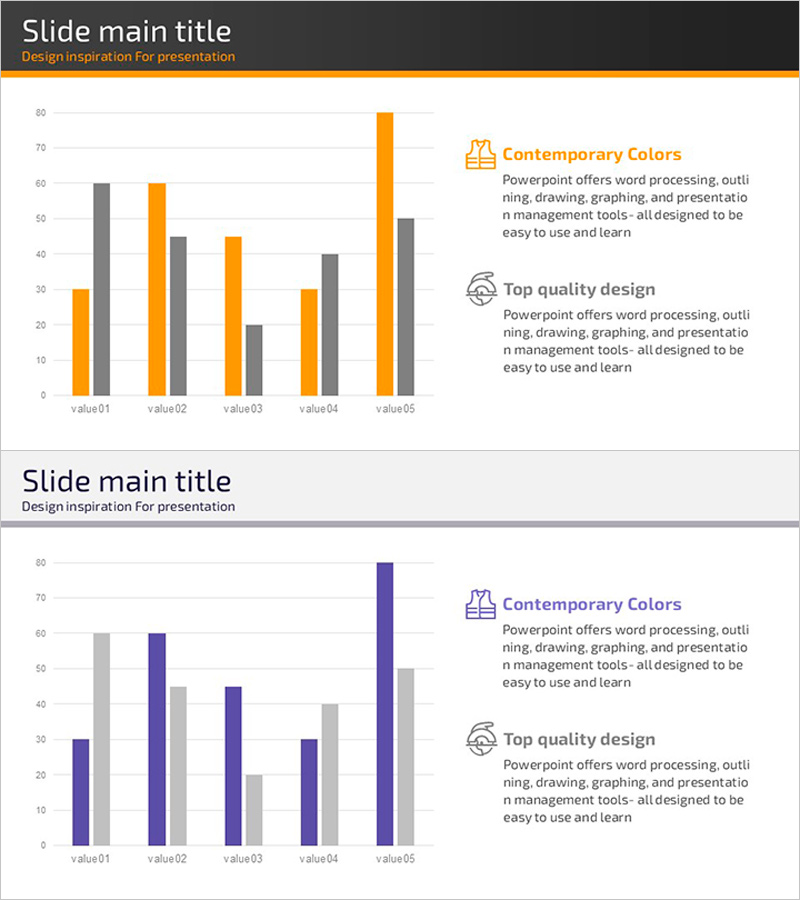
A grouped bar chart PowerPoint slide featuring orange and purple color schemes for clear data comparison across two series. This presentation template displays five items (value01 through value05) with dual-series data visualization, making it ideal for product performance comparisons, quarterly results analysis, competitive benchmarking, and market performance reviews. The 16:9 widescreen format includes 2 slides that integrate seamlessly into your presentation deck. All values, labels, and legend text are fully editable, allowing you to customize the chart with your own data in minutes.
Usage Points
-
Main Usage
This chart excels at comparing two or more data series side-by-side across multiple categories. Perfect for quarterly performance reports, product feature comparisons, regional sales analysis, competitive positioning, budget variance analysis, and any scenario requiring quantitative multi-series comparison.
-
How to Use
Select one of the two grouped bar chart layouts on the slides. Replace the legend labels (Contemporary Colors, Top quality design) and data values (value01~value05, 0~80 scale) with your own information. The orange and purple color scheme can be retained or modified using PowerPoint's theme color options.
-
Recommended For
Marketing managers, sales directors, financial analysts, business strategists, management consultants, and data-driven professionals. Ideal for quarterly business reviews, product launch presentations, market analysis reports, investment proposals, and performance dashboards.
-
Slide Structure
2-slide set with one grouped bar chart per slide. Each chart displays 5 categories (value01~value05) with orange and purple bars positioned side-by-side for direct comparison. Y-axis ranges from 0 to 80 with gridlines, and includes a legend identifying each data series.
Related Products
-

Big Data Development Status Radial Graph – Captivating Visual Appeal
#Product/Service Introduction #Business Introduction #Diagram
-

Analysis of User Gender Ratio by Target Country – Providing Market Insights
#Market and Competitor Analysis #Graph #Other
-

SEO System Comparison Analysis Bar Graph
#Market and Competitor Analysis #Graph #Competitor Analysis
-

Sales and Profit Comparison Graph & Table – Clear Financial Analysis
#Financial Plans and Performance #Diagram #Graph
