Red Green Line Chart – Sales and Performance Analysis
RJ0800047_8
- Last Update 08/13/2025
- File Size 0.2MB
- # of Slides 2
- File Format PPTX
- Slide Ratio 16:9
- Color
Keywords
- #Content-Based Slides
- #Design-Based Slides
- #Business Strategy
- #Financial Plans and Performance
- #Graph
- #Achievements
- #Sales and Revenue
- #Line
- #Line Chart
- #16:9
- #line chart PowerPoint
- #dual series line graph
- #sales trend analysis slide
- #how to create line chart in PowerPoint
- #performance data visualization
- #trend analysis presentation template
About the Product
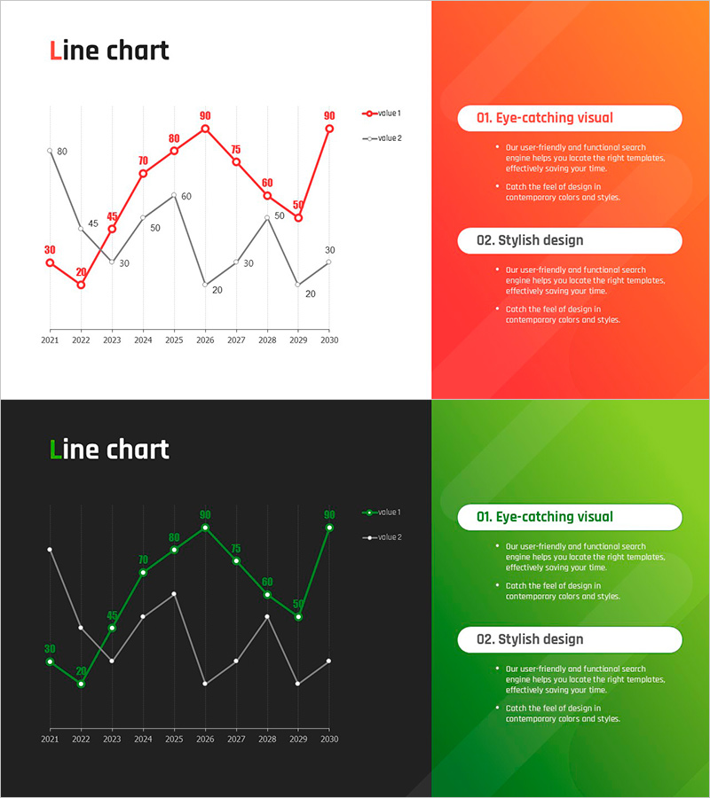
A line chart PowerPoint slide visualizing 10 years of sales and performance data from 2021 to 2030. Two data series in red and green enable side-by-side comparison and trend analysis, with numerical values displayed at each data point for precise information delivery. This 16:9 widescreen presentation slide set includes 2 layouts with both light and dark background options, ready to integrate into any corporate presentation. Each data point is clearly labeled, making it ideal for financial reports, performance reviews, and strategic planning presentations.
Usage Points
-
Main Usage
Designed to display annual sales trends, departmental performance comparisons, and time-series data analysis at a glance. The dual-series format enables correlation analysis and performance benchmarking between two independent datasets, making it ideal for comparative financial analysis.
-
How to Use
Integrate into financial reports, business performance presentations, and marketing analysis decks as your primary data visualization section. Replace the sample data points with your actual figures, customize the legend and axis labels, and adjust the color scheme to match your corporate branding.
-
Recommended For
Finance teams, marketing departments, executive reporting managers, business analysts, and consultants who need to communicate quantitative results persuasively. Particularly effective for quarterly and annual performance reviews, investor presentations, and executive briefings.
-
Slide Structure
Each slide features 2 independent line series, 10 annual data points with labeled values, a legend identifying each series, and clearly marked X-axis (years) and Y-axis (numerical values). The light background version emphasizes orange accents, while the dark background version highlights green tones for visual contrast.
Related Products
-

Geometric Pattern Wide PowerPoint Line Chart – Business Performance Analysis
#Business Strategy #Financial Plans and Performance #Graph
-

Key Performance Graphs – Business Strategy and Performance
#Business Strategy #Financial Plans and Performance #Graph
-

Highlighting Key Data Points in Trends – Performance and Vision
#Business Strategy #Financial Plans and Performance #Graph
-

Visualize Performance with Line Graph Trends – Business Strategy
#Business Strategy #Financial Plans and Performance #Graph
