Performance Analysis Visualization with Line Graph – Challenge and Success
RJ0600098_11
- Last Update 07/17/2025
- File Size 0.1MB
- # of Slides 2
- File Format PPTX
- Slide Ratio 16:9
- Color
Keywords
- #Content-Based Slides
- #Design-Based Slides
- #Business Strategy
- #Financial Plans and Performance
- #Graph
- #Achievements
- #Sales and Revenue
- #Line
- #Line Chart
- #16:9
- #line chart PowerPoint slide
- #multi-series trend analysis
- #performance data visualization
- #business analytics slide template
- #how to create line graph in PowerPoint
About the Product
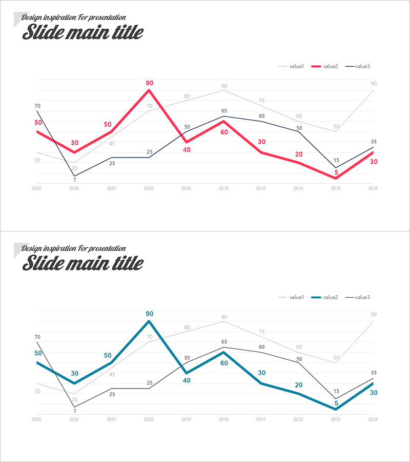
A multi-series line chart PowerPoint slide that compares three data sets across time from 2005 to 2018. The slide uses red, blue, and black lines to distinguish each data series, with precise numerical labels at every data point for accurate interpretation. Formatted in 16:9 widescreen ratio with 2 slides, this presentation template is ready to use for business performance reporting, marketing analytics, and financial trend analysis. All chart data, colors, and legends are fully editable, allowing you to customize the slide with your own statistics and metrics.
Usage Points
-
Main Usage
Designed to compare multiple performance indicators simultaneously across time periods. Enables clear visualization of sales trends, customer satisfaction metrics, market share changes, and other key performance indicators on a single slide for data-driven decision making.
-
How to Use
Insert into the data analysis section of annual reports, quarterly performance reviews, marketing campaign evaluations, and financial presentations. Edit the numerical values, line colors, and legend labels to match your actual business data before presenting.
-
Recommended For
Ideal for executives, marketing teams, finance departments, and sales professionals who need to present quantitative performance analysis. Particularly suited for quarterly earnings reports, investor presentations, board meetings, and internal management reviews.
-
Slide Structure
Consists of 2 slides, each containing a 3-series line chart. The X-axis displays years from 2005 to 2018, the Y-axis shows a 0-90 numerical scale, and three distinct colored lines (red, blue, black) represent different data series with labeled values at each data point.
Related Products
-

Highlighting Key Data Points in Trends – Performance and Vision
#Business Strategy #Financial Plans and Performance #Graph
-

Kids Drawing Line Graph – Emphasizing Performance
#Business Strategy #Financial Plans and Performance #Graph
-

Visualizing Annual Sales Performance Trends - Graph Slide
#Business Strategy #Financial Plans and Performance #Graph
-

Visualize Performance with Line Graph Trends – Business Strategy
#Business Strategy #Financial Plans and Performance #Graph
