Graph Slide Showing Status of Food Truck Sales
RJ0800013_6
- Last Update 08/03/2025
- File Size 0.4MB
- # of Slides 2
- File Format PPTX
- Slide Ratio 16:9
- Color
Keywords
- #Content-Based Slides
- #Design-Based Slides
- #Financial Plans and Performance
- #Diagram
- #Graph
- #Projected Return on Investment (ROI)
- #Sales and Revenue
- #Cluster
- #Line
- #Closed Cluster Diagram
- #Line Chart
- #16:9
- #line chart PowerPoint slide
- #dual-series chart template
- #trend comparison slide
- #line graph PowerPoint download
- #data visualization slide
About the Product
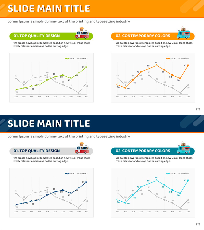
A professional line chart PowerPoint slide comparing two data series across a 10-year timeline from 2022 to 2031. The dual-line design uses orange and blue colors to clearly distinguish between two datasets, with precise numerical values displayed at each data point for accurate analysis. This 16:9 widescreen slide is ready to integrate into business presentations, financial reports, and performance dashboards. Perfect for visualizing sales trends, revenue growth, market performance, or any comparative time-series data in your PowerPoint presentation.
Usage Points
-
Main Usage
Designed to compare two or more data series over time and identify trends, patterns, and performance gaps. Ideal for presenting sales figures, revenue metrics, market share, customer satisfaction scores, or any comparative time-series data that requires visual clarity and analytical depth.
-
How to Use
Insert this slide into quarterly business reports, financial analysis presentations, marketing performance reviews, and strategic planning meetings. Simply replace the sample data with your own figures and adjust the axis labels to match your dataset. The pre-formatted layout ensures professional appearance with minimal editing.
-
Recommended For
Finance teams, marketing departments, sales executives, and business analysts who need to present data-driven insights. Suitable for investor presentations, board meetings, annual performance reviews, departmental reports, and strategic planning sessions where trend comparison is critical.
-
Slide Structure
Two-slide set featuring dual-line charts with orange and blue series. X-axis spans 2022–2031 (10-year period), Y-axis ranges from 0–90. Each data point displays its numerical value. Legend clearly identifies both series. Layout optimized for 16:9 widescreen format.
Related Products
-

Liquor Sales Line Chart – Visualizing Revenue and Profit
#Financial Plans and Performance #Graph #Projected Return on Investment (ROI)
-

Red Green Basic Line Charts – Visualizing Financial Performance
#Financial Plans and Performance #Graph #Projected Return on Investment (ROI)
-

Real Estate Upside Down Chart – Visualizing Market Trends
#Market and Competitor Analysis #Financial Plans and Performance #Graph
-

Chemical Experiment Analysis Broken Line Graph – Insights and Data Visualization
#Market and Competitor Analysis #Diagram #Graph
