Graph Slide Visualizing Average Monthly Eating Out Consumption Trends
RJ0800046_20
- Last Update 08/13/2025
- File Size 0.2MB
- # of Slides 2
- File Format PPTX
- Slide Ratio 16:9
- Color
Keywords
- #Content-Based Slides
- #Design-Based Slides
- #Market and Competitor Analysis
- #Financial Plans and Performance
- #Graph
- #Competitive Advantage
- #Sales and Revenue
- #Line
- #Line Chart
- #16:9
- #line chart PowerPoint slide
- #multi-series trend visualization
- #consumption trend chart
- #time-series data PowerPoint
- #how to create line graph in PowerPoint
About the Product
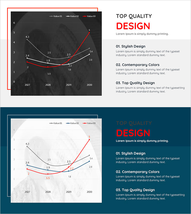
A multi-series line chart PowerPoint slide visualizing monthly average eating-out consumption trends across four years (2027–2030). The dark gray background features three distinct data series in white, black, and red lines, with precise numerical values marked at each data point for accurate comparison. This presentation slide is ready to use for market analysis, consumer behavior reports, and trend forecasting. The 16:9 widescreen format includes two slide variations—dark and light backgrounds—for flexible presentation contexts.
Usage Points
-
Main Usage
Visualize temporal trends, market changes, and performance metrics using multi-series line charts to support data-driven decision-making. Compare multiple data series simultaneously to reveal correlations, patterns, and inflection points in business metrics.
-
How to Use
Insert monthly, quarterly, or annual trend data into marketing reports, market analysis presentations, consumer behavior studies, financial performance reviews, and business planning sessions. Customize legend labels, axis titles, and data values to fit industry-specific metrics and organizational contexts.
-
Recommended For
Marketing professionals, market analysts, financial officers, executives, consulting firms, and research institutions presenting consumption trends, sales performance, market dynamics, and business forecasts with objective, quantitative evidence.
-
Slide Structure
Two-slide set: Slide 1 features dark gray background with three line series (white, black, red), X-axis spanning 2027–2030, Y-axis 0–6, and data point values labeled. Slide 2 provides identical chart structure on light background. All elements—legend, axis labels, data values—are fully editable in PowerPoint.
Related Products
-

Slide Visualizing Sales Performance Trend in the Kids Market
#Market and Competitor Analysis #Financial Plans and Performance #Graph
-

Product-wise Vertical Bar Chart and Analysis - Market and Competitive Analysis
#Market and Competitor Analysis #Financial Plans and Performance #Graph
-

Sales and Net Income Graph – Visualizing Business Performance
#Market and Competitor Analysis #Financial Plans and Performance #Graph
-

Graph Analysis by Year Sales
#Market and Competitor Analysis #Financial Plans and Performance #Graph
