Liquor Sales Line Chart – Visualizing Revenue and Profit
RJ0600043_20
- Last Update 07/02/2025
- File Size 0.2MB
- # of Slides 2
- File Format PPTX
- Slide Ratio 16:9
- Color
Keywords
- #Content-Based Slides
- #Design-Based Slides
- #Financial Plans and Performance
- #Graph
- #Projected Return on Investment (ROI)
- #Sales and Revenue
- #Line
- #Line Chart
- #16:9
- #line chart PowerPoint
- #dual-series chart slide
- #sales trend visualization
- #financial data PowerPoint
- #how to create line chart in PowerPoint
- #revenue graph template download
About the Product
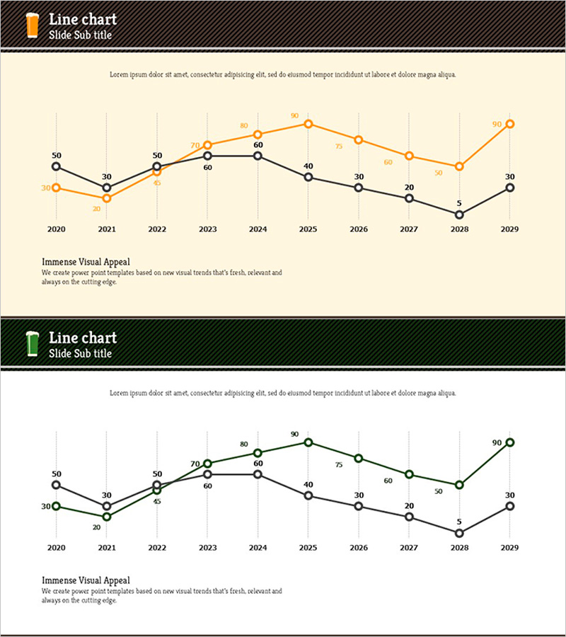
A line chart PowerPoint slide visualizing liquor sales and revenue trends over a decade. Two data series in orange and black clearly show comparative performance metrics from 2020 to 2029. Each data point is labeled with numerical values for precise comparison, and the beige background with grid structure enhances readability. Ideal for financial reports, business plans, investor presentations, and quarterly earnings reviews where sales trajectory and profitability analysis need clear visual communication.
Usage Points
-
Main Usage
Visualize and compare annual sales and revenue changes over time. The two-series design (orange and black lines) allows you to represent different metrics simultaneously—such as actual vs. projected sales, revenue vs. profit, or year-over-year comparisons—making it versatile for various financial analysis scenarios.
-
How to Use
Use this slide in the financial forecast section of business plans, quarterly or annual performance reports, and investor relations (IR) presentations. Simply replace the data points and numerical labels with your actual figures, and adjust colors and legend labels as needed. The grid background and axis labels support easy data interpretation.
-
Recommended For
Finance managers, CFOs, business planning teams, marketing professionals, and investor relations specialists presenting sales performance and revenue forecasts to executives, investors, and stakeholders. Particularly effective for beverage, alcohol, and consumer goods industries showcasing performance analysis and future outlook.
-
Slide Structure
Two-slide template with 10 data points spanning 2020–2029. Orange series (50→30→50→60→60→40→30→20→50→90) and black series (30→30→50→60→40→30→20→5→50→30) intersect and diverge throughout the timeline. Grid background and Y-axis scale (0–50 or 0–90) facilitate value comparison and trend identification.
Related Products
-

Red Green Basic Line Charts – Visualizing Financial Performance
#Financial Plans and Performance #Graph #Projected Return on Investment (ROI)
-

Graph Slide Showing Status of Food Truck Sales
#Financial Plans and Performance #Diagram #Graph
-

Line Graph Visualizing Future Market Outlook for Sailing Travel
#Market and Competitor Analysis #Financial Plans and Performance #Graph
-

Comparison Graph by Transportation Industry – Market Analysis and Financial Performance
#Market and Competitor Analysis #Financial Plans and Performance #Graph
