Professional Presentation Slide Visualizing Performance Chart Statistics
RJ0800008_25
- Last Update 08/01/2025
- File Size 0.6MB
- # of Slides 2
- File Format PPTX
- Slide Ratio 16:9
- Color
Keywords
- #Content-Based Slides
- #Design-Based Slides
- #Market and Competitor Analysis
- #Diagram
- #Graph
- #Market Analysis
- #Market Overview
- #Cluster
- #Closed Cluster Diagram
- #16:9
- #line chart PowerPoint slide
- #multi-series trend visualization
- #business data presentation
- #performance metrics chart
- #statistical graph template download
About the Product
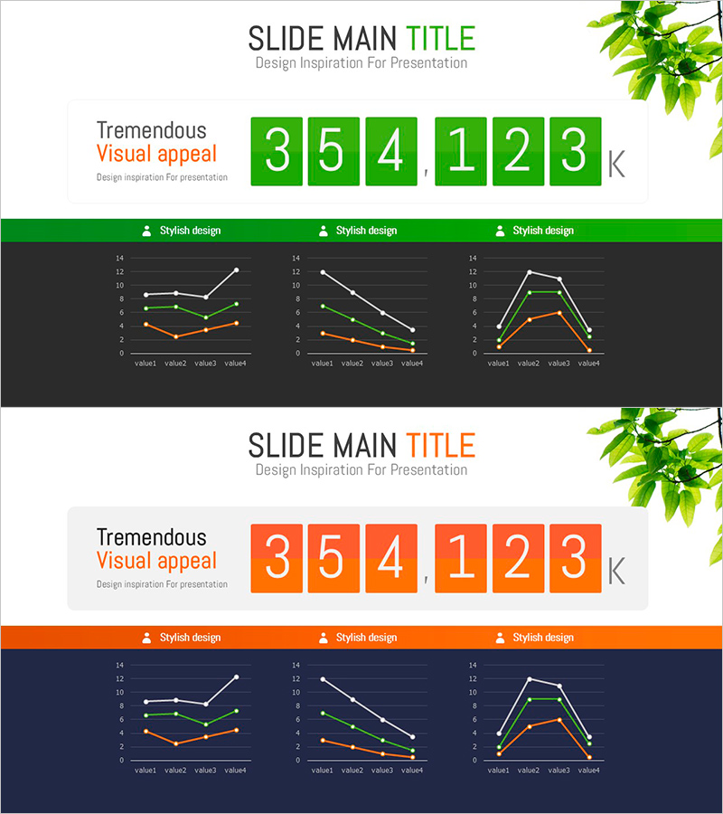
A professional 2-slide PowerPoint presentation template for visualizing performance metrics and statistical data. Features three line charts with multi-series trend visualization in green and orange color schemes against a dark background. Each chart displays four data points connected by three distinct lines, enabling clear comparison of trends across different metrics. The design includes styled header sections with 'Stylish design' labels for added professionalism. Provided in 16:9 widescreen PPTX format, ready for immediate use in business reports, quarterly performance presentations, and market analysis documents.
Usage Points
-
Main Usage
Visualize quarterly or monthly performance trends, compare market share changes, and display sales volume comparisons across multiple data series simultaneously. Enables effective trend analysis and performance comparison in executive presentations.
-
How to Use
Insert into management reports, quarterly earnings presentations, market analysis documents, and investor pitch decks. Edit data values in each chart to input actual metrics. Customize colors and labels as needed for your specific business context.
-
Recommended For
Finance and planning teams presenting quarterly results, marketing teams analyzing market trends, sales teams showcasing performance achievements, consulting firms preparing client proposals, and academic researchers presenting data analysis findings.
-
Slide Structure
2-slide template with 3 line charts per slide arranged horizontally. Each chart contains 4 data points (value1 through value4) connected by 3 distinct trend lines in green, orange, and white. Dark background throughout with header area for titles and style labels.
Related Products
-

Data-driven Trend Analysis PowerPoint Template - Market Insights
#Market and Competitor Analysis #Diagram #Graph
-

Market Share Change Visualized in Donut Chart
#Market and Competitor Analysis #Diagram #Graph
-

Graph of Industrial Change and Global Market Analysis – Understanding Market Trends
#Market and Competitor Analysis #Diagram #Graph
-

Expected Effects Based on Market Analysis – Insights Visualized by Data
#Business Strategy #Market and Competitor Analysis #Diagram
