Green Orange Stereographic Bar Graph – Captivating Data Visualization
RJ0800005_4
- Last Update 08/01/2025
- File Size 11.4MB
- # of Slides 2
- File Format PPTX
- Slide Ratio 16:9
- Color
Keywords
About the Product
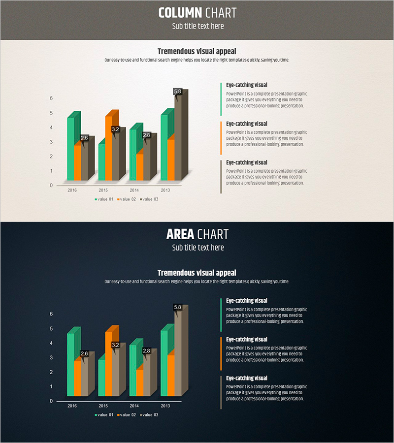
A professional 3D column chart PowerPoint slide designed to compare four data series side by side. The green and orange color scheme creates strong visual contrast, making each data series instantly recognizable. Two background versions—gray and beige—are included to match different presentation themes. Perfect for displaying year-over-year trends (2016–2013), departmental performance metrics, or product comparisons. This presentation slide transforms numerical data into compelling visuals that capture audience attention and enhance data credibility in reports, proposals, and investor pitches.
Usage Points
-
Main Usage
Compare performance metrics across four data series—such as annual trends, departmental results, or product sales—in a single, visually impactful chart. The 3D effect enhances visual appeal while maintaining data clarity, making it ideal for executive briefings, quarterly reports, and investor presentations.
-
How to Use
Simply input your numerical values into the chart, and the column heights adjust automatically. Colors (green, orange, gray) can be customized to match your corporate branding. Modify axis labels and legend text to fit your specific data context and presentation narrative.
-
Recommended For
Finance, marketing, and sales teams presenting quarterly or annual performance reviews, product sales comparisons, and regional revenue analysis. Ideal for board meetings, investor relations presentations, C-suite briefings, and strategic planning sessions where data-driven decision-making is essential.
-
Slide Structure
Two slides with identical layouts: gray background and beige background versions. Each slide features 4 data series (value 01, 02, 03) across 4 time periods (2016, 2015, 2014, 2013), plus three text callout boxes on the right for annotations and insights.
Related Products
-

City Theme Market Share Graph – Business Data Visualization
#Product/Service Introduction #Market and Competitor Analysis #Graph
-

Big Data Analysis Line Graph – Visualizing Competitive Advantage
#Market and Competitor Analysis #Graph #Competitor Analysis
-

Technology Service Market Trends and Status – 100% Stacked Bar Chart
#Market and Competitor Analysis #Graph #Market Status
-

Competitor Analysis and Competitive Advantage Double Bar Chart
#Market and Competitor Analysis #Graph #Competitor Analysis
