Horizontal Bar Graph Visualizing Cosmetic Sales Rankings
RJ0800028_27
- Last Update 08/07/2025
- File Size 2.7MB
- # of Slides 2
- File Format PPTX
- Slide Ratio 16:9
- Color
Keywords
- #Content-Based Slides
- #Design-Based Slides
- #Company Introduction
- #Financial Plans and Performance
- #Graph
- #Key Achievements
- #Sales and Revenue
- #Other
- #Other Charts
- #16:9
- #vertical bar chart PowerPoint
- #sales ranking presentation slide
- #10-item comparison graph
- #cosmetic sales data visualization
- #bar graph PowerPoint template
About the Product
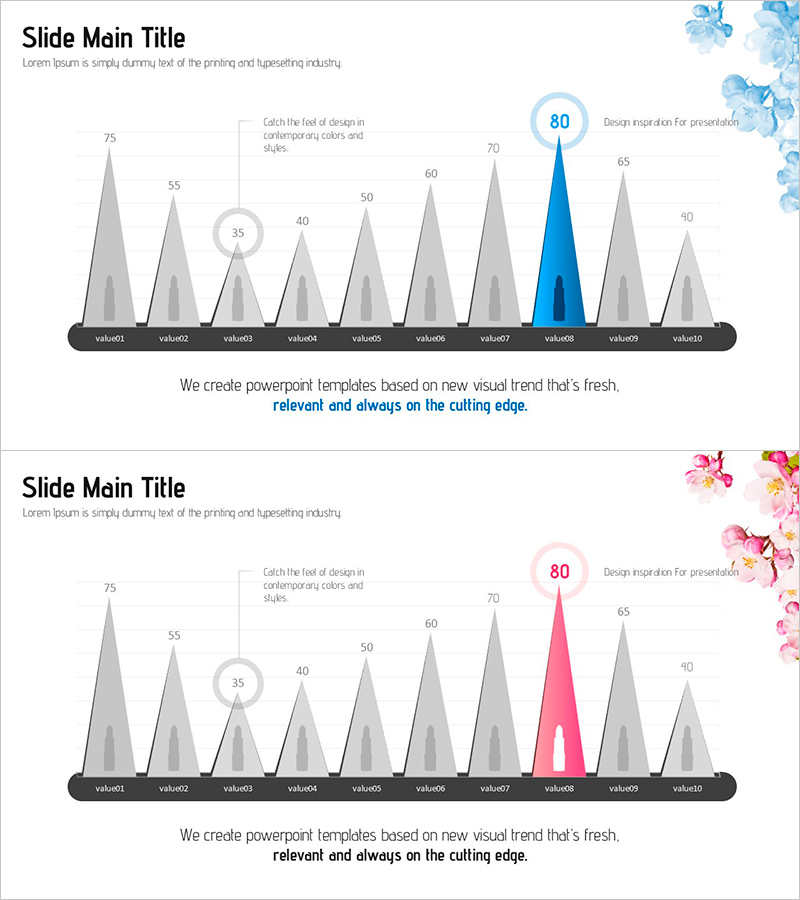
A vertical bar chart PowerPoint slide that visualizes cosmetic product sales rankings across 10 items. Gray bars represent each product's sales value, with the highest-performing item highlighted in blue or pink accent color to draw attention. Numeric badges positioned above each bar display exact data values for quick reference, while a legend and descriptive text at the bottom clarify the chart's purpose. Provided in 16:9 widescreen format with 2 slides, all colors and values are fully editable to match your presentation needs.
Usage Points
-
Main Usage
Present quantitative sales data, product rankings, and market share comparisons in a clear, visual format. Beyond cosmetics and beauty, this chart template works for retail, distribution, marketing, and financial performance analysis across any industry requiring multi-item numerical comparison.
-
How to Use
Open the slide and replace each bar height and numeric value with your actual data. Adjust the accent color (blue or pink) to match your brand identity, update the legend and title text to fit your presentation context, then insert into your deck. All elements are grouped for easy resizing and color modification.
-
Recommended For
Marketing managers, sales directors, financial analysts, product planners, and business intelligence professionals presenting monthly, quarterly, or annual sales performance, product-level revenue comparison, and competitive rankings. Ideal for executive briefings, team meetings, client presentations, and board reports.
-
Slide Structure
Slide 1: Title area + 10 vertical bars representing data values (range 35–80) + numeric circular badges above each bar + bottom legend and explanatory text. Slide 2: Color variant (pink accent) with identical structure. All elements are grouped for seamless resizing and color customization.
Related Products
-

Parallelogram Graph & Table – Visualizing Product/Service Introduction and Financial Performance
#Product/Service Introduction #Financial Plans and Performance #Diagram
-

Market Sales by Tea Type – Highlighting Key Performance
#Company Introduction #Financial Plans and Performance #Graph
-

KPI Target vs Actual Slide – 4-Metric Dark Red & Purple
#Company Introduction #Business Strategy #Financial Plans and Performance
-

Visualizing Product-specific Target Achievement Percentage – Cluster Diagram
#Company Introduction #Financial Plans and Performance #Diagram
