Experimental Results Analysis Vertical Bar Graph – Incorporating Visual Trends
RJ0700019_29
- Last Update 07/27/2025
- File Size 0.3MB
- # of Slides 2
- File Format PPTX
- Slide Ratio 16:9
- Color
Keywords
- #Content-Based Slides
- #Design-Based Slides
- #Market and Competitor Analysis
- #Diagram
- #Graph
- #Competitor Analysis
- #Market Analysis
- #Cluster
- #Column
- #Closed Cluster Diagram
- #Grouped Column
- #16:9
- #grouped bar chart PowerPoint
- #vertical bar graph slide template
- #data comparison presentation
- #experimental results analysis PowerPoint
- #chart slide design download
About the Product
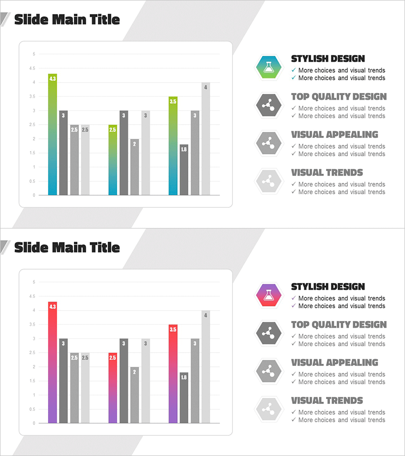
A 2-slide PowerPoint presentation featuring grouped vertical bar charts designed for experimental results analysis and data comparison. The slides display three data series in teal, green, and gray colors arranged side-by-side for direct comparison across multiple categories. Each bar is labeled with precise numerical values for enhanced readability. The right side of each slide includes four hexagonal icons with checkmark descriptions to highlight key insights. The diagonal background pattern adds visual dynamism to the presentation. These PowerPoint slides are ready to use for market analysis, competitive benchmarking, performance evaluation, and research findings.
Usage Points
-
Main Usage
Visualizes and compares multiple data points across categories using three distinct data series. The grouped bar format enables side-by-side comparison of values, making it ideal for highlighting differences and trends across experimental conditions, market segments, or performance metrics.
-
How to Use
Slide 1 emphasizes the chart with supporting text elements on the right. Slide 2 mirrors the layout with four hexagonal icons and checkmark bullets for detailed explanation. Replace the sample data values with your actual numbers and update the icon descriptions to match your key findings.
-
Recommended For
Data analysis reports, executive presentations, marketing strategy reviews, academic presentations, performance evaluations, and quarterly business reviews. Suitable for finance, IT, manufacturing, education, and healthcare sectors requiring quantitative data visualization.
-
Slide Structure
Each slide contains: title area + grouped vertical bar chart (approximately 10 categories with 3 data series) + right-side panel with 4 hexagonal icons and checkmark text. Color scheme: teal, green, and gray gradient bars with diagonal background pattern accent.
Related Products
-

Business Plan Competitor Analysis Chart – Effective Market Analysis Tool
#Market and Competitor Analysis #Diagram #Graph
-

Business Area Analysis Graph – Suitable for Market and Competitive Analysis
#Market and Competitor Analysis #Diagram #Graph
-

Competitor Comparison Analysis Bar Graph – Data Visualization for Market Analysis
#Market and Competitor Analysis #Diagram #Graph
-

VR Market Analysis Bar Graph
#Market and Competitor Analysis #Diagram #Graph
