Competitor Comparison Analysis Bar Graph – Data Visualization for Market Analysis
RJ0300065_26
- Last Update 05/06/2025
- File Size 0.8MB
- # of Slides 2
- File Format PPTX
- Slide Ratio 16:9
- Color
Keywords
- #Content-Based Slides
- #Design-Based Slides
- #Market and Competitor Analysis
- #Diagram
- #Graph
- #Competitor Analysis
- #Market Analysis
- #Cluster
- #Column
- #Closed Cluster Diagram
- #Grouped Column
- #16:9
- #grouped bar chart PowerPoint
- #competitor comparison analysis slides
- #market analysis graph template
- #vertical horizontal bar chart
- #data visualization PowerPoint template
About the Product
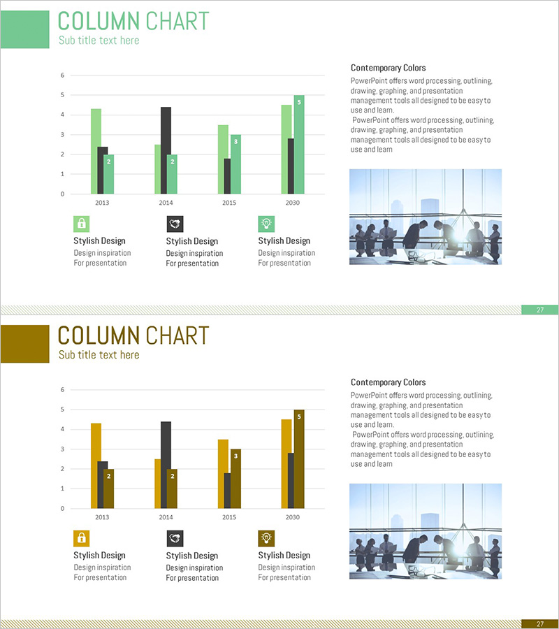
A 2-slide PowerPoint set featuring grouped bar charts designed for competitor comparison and market analysis. The slides showcase vertical and horizontal bar chart layouts in green and brown dual-tone color schemes, displaying multi-year data (2013–2030) across four data series for comprehensive performance comparison. Ideal for visualizing competitive benchmarking, market share analysis, sales trends, and revenue comparisons in business presentations. Provided in 16:9 widescreen PPTX format, fully editable to accommodate your own datasets and metrics.
Usage Points
-
Main Usage
Compare competitor performance, analyze market share, and visualize sales or revenue trends across multiple data series simultaneously. The dual-layout approach (vertical and horizontal bar charts) allows you to present the same data from different perspectives, adapting to various presentation contexts and audience preferences.
-
How to Use
Integrate these slides into marketing strategy documents, business reports, and investor pitch decks within the market analysis section. Use them to demonstrate year-over-year performance trends, compare multiple products or regional markets, or benchmark departmental results. Easily customize axis labels, legends, and data values to match your specific metrics.
-
Recommended For
Marketing managers, sales directors, business analysts, management consultants, and executives who rely on data-driven decision-making. Particularly valuable during competitive analysis, market research presentations, performance reviews, and strategic planning sessions where quantitative evidence is essential.
-
Slide Structure
Two-slide layout: Slide 1 features a vertical grouped bar chart with green accent color (4 data series, 4 time periods); Slide 2 displays a horizontal grouped bar chart with brown accent color (identical data structure). Each slide includes a descriptive text area and business team imagery on the right. Optimized for 16:9 widescreen format.
Related Products
-

Business Plan Competitor Analysis Chart – Effective Market Analysis Tool
#Market and Competitor Analysis #Diagram #Graph
-

Business Area Analysis Graph – Suitable for Market and Competitive Analysis
#Market and Competitor Analysis #Diagram #Graph
-

VR Market Analysis Bar Graph
#Market and Competitor Analysis #Diagram #Graph
-

Clustered Vertical Bar Graph Slide – Visualizing Market Analysis
#Market and Competitor Analysis #Diagram #Graph
