White Black Bundle Horizontal Bar Graph
RJ0700008_22
- Last Update 07/23/2025
- File Size 1.2MB
- # of Slides 2
- File Format PPTX
- Slide Ratio 16:9
- Color
Keywords
- #Content-Based Slides
- #Design-Based Slides
- #Market and Competitor Analysis
- #Graph
- #Market Analysis
- #Horizontal Bar
- #Grouped Horizontal Bar
- #16:9
- #grouped bar chart PowerPoint
- #horizontal bar graph template
- #multi-series data comparison slide
- #business analytics chart
- #how to create grouped bar chart in PowerPoint
About the Product
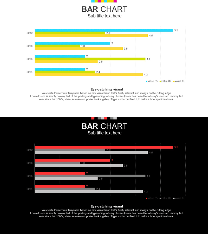
A grouped horizontal bar chart PowerPoint slide designed for comparing multiple data series across years or categories. This template includes two design variations: a light background version and a dark background version, each displaying three data series side by side. Perfect for business reports, market analysis presentations, and performance reviews. The color scheme uses cyan, yellow, and gray bars with clear data labels, making it easy to distinguish between series and communicate precise numerical information to your audience.
Usage Points
-
Main Usage
This chart excels at displaying comparative data across multiple categories or time periods. The grouped layout allows viewers to compare three data series simultaneously, making it ideal for year-over-year analysis, departmental performance comparison, market share visualization, and sales trend reporting.
-
How to Use
Insert this slide into the analysis or results section of your presentation. Use the light background version for printed materials and screen presentations in bright environments, and the dark background for digital displays. Simply replace the data values and labels with your own information using PowerPoint's built-in chart editing tools.
-
Recommended For
Finance professionals, marketing teams, sales departments, and executives preparing quarterly reports or annual performance reviews. Ideal for competitive analysis, KPI tracking, budget variance analysis, and any presentation requiring multi-dimensional numerical comparison.
-
Slide Structure
Each slide displays four years of data (2030, 2028, 2026, 2024) with three grouped bars per year representing different data series. Bars are color-coded in cyan, yellow, and gray with numerical labels at the end of each bar. A legend at the top identifies each series, and a grid background aids in value reading.
Related Products
-

Company Status Analysis Slide – Market and Competitor Analysis
#Company Introduction #Market and Competitor Analysis #Graph
-

Horizontal Bar Chart for Financial Business Market Analysis
#Market and Competitor Analysis #Graph #Competitor Analysis
-

Cybersecurity Business Market Analysis Graph
#Market and Competitor Analysis #Graph #Competitor Analysis
-

Market Analysis Bar Graph – Effective Data Visualization
#Market and Competitor Analysis #Graph #Market Analysis
