Chemical Experiment Analysis Broken Line Graph – Insights and Data Visualization
RJ0700008_15
- Last Update 07/23/2025
- File Size 1.2MB
- # of Slides 2
- File Format PPTX
- Slide Ratio 16:9
- Color
Keywords
- #Content-Based Slides
- #Design-Based Slides
- #Market and Competitor Analysis
- #Diagram
- #Graph
- #Market Status
- #Market Analysis
- #Cluster
- #Line
- #Closed Cluster Diagram
- #Line Chart
- #16:9
- #line chart PowerPoint
- #trend analysis presentation slide
- #multi-series line graph
- #data visualization template
- #market analysis chart
- #time-series data PowerPoint slide
About the Product
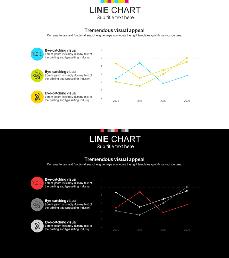
A multi-series line chart PowerPoint slide visualizing data trends from 2024 to 2030 across three distinct data series in cyan, yellow, and orange. The intersecting lines with point markers and gridlines enable precise data reading and comparison of changing patterns over time. Ideal for business presentations including market analysis, competitive benchmarking, and performance tracking. Includes two slide layouts—light background and dark background versions—for flexible presentation environments. Fully editable PPTX format with 2 slides.
Usage Points
-
Main Usage
Designed to compare and analyze multiple data series simultaneously over time, making it ideal for displaying market growth rates, competitive sales comparisons, and product performance trends. Enables stakeholders to quickly identify correlations and divergences between different metrics.
-
How to Use
Double-click the data values within the chart to edit directly; the graph updates automatically. Customize series colors, line thickness, and marker styles to emphasize key data points. Use the light background version for daytime presentations and printing; switch to the dark background version for evening events and projector-based presentations.
-
Recommended For
Recommended for executive reports, quarterly performance reviews, market analysis presentations, investor briefings, academic presentations, and consulting proposals. Particularly suited for finance, marketing, sales, and strategy teams who need to communicate quantitative insights and support data-driven decision-making.
-
Slide Structure
Two-slide layout with identical line chart structure on each. X-axis displays years (2024, 2026, 2028, 2030); Y-axis ranges from 0 to 6. Three data series (cyan, yellow, orange) intersect across the chart with circular point markers at each data point. Left side includes icon-based legend and text area explaining the three series.
Related Products
-

Competitor Analysis Broken Line Graph – Visualizing Market Trends
#Market and Competitor Analysis #Diagram #Graph
-

Curved Charts for Products – Visualizing Market Conditions with Diagrams
#Market and Competitor Analysis #Graph #Market Status
-

Usage Analysis Graph – Visualizing Market Status
#Market and Competitor Analysis #Diagram #Graph
-

Market Analysis and Status Graph Slide – Harmony of Green and Orange
#Market and Competitor Analysis #Graph #Market Status
