Market Analysis and Status Graph Slide – Harmony of Green and Orange
RJ0400024_19
- Last Update 05/24/2025
- File Size 2.3MB
- # of Slides 2
- File Format PPTX
- Slide Ratio 16:9
- Color
Keywords
- #Content-Based Slides
- #Design-Based Slides
- #Market and Competitor Analysis
- #Graph
- #Market Status
- #Market Analysis
- #Column
- #Line
- #Grouped Column
- #Line Chart
- #16:9
- #line graph PowerPoint slide
- #trend analysis presentation template
- #market analysis chart
- #data visualization PPT
- #bar chart combination slide
About the Product
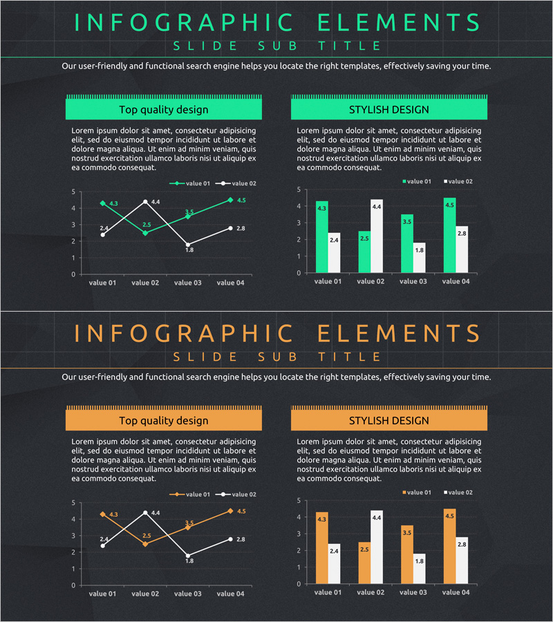
A line graph PowerPoint slide designed to visualize market analysis and current status data. Two color schemes—green and orange—distinguish four data series showing trend changes over time, paired with a vertical bar chart for multi-angle comparison. Optimized for 16:9 widescreen format in a 2-slide set, this template is ready to use in marketing reports, business analysis presentations, and performance reviews. Clear value labels and legends enhance audience comprehension and data clarity.
Usage Points
-
Main Usage
Simultaneously display trend changes over time and numerical comparisons across multiple items. Line graphs emphasize directional flow while bar charts clarify absolute values, making it ideal for complex data analysis.
-
How to Use
Apply to market overview sections in marketing reports, performance trend presentations for sales teams, quarterly or monthly comparison materials, and executive briefings. Edit legends and axis labels to match your specific data.
-
Recommended For
Marketing teams presenting market analysis, sales teams reporting performance metrics, executives reviewing business status, and consulting firms preparing client analysis documents.
-
Slide Structure
2-slide set: First slide features a green-toned line graph with 2 series across 4 data points; second slide displays an orange-toned vertical bar chart with 2 series in grouped format across 4 items. Each slide includes title area, descriptive text space, and legend section.
Related Products
-

Usage Analysis Graph – Visualizing Market Status
#Market and Competitor Analysis #Diagram #Graph
-

Consumer Insights & Behavioral Patterns Analysis Slide
#Market and Competitor Analysis #Graph #Market Status
-

Geometry Wide Line Graph – Perfect Choice for Market Analysis
#Market and Competitor Analysis #Graph #Market Status
-

Business Analysis Line Graph – Visualizing Market Trends
#Market and Competitor Analysis #Graph #Market Status
