Year-by-Year Science Experiment Analysis Bar Graph
RJ0700007_19
- Last Update 07/23/2025
- File Size 12.2MB
- # of Slides 2
- File Format PPTX
- Slide Ratio 16:9
- Color
Keywords
- #Content-Based Slides
- #Design-Based Slides
- #Product/Service Introduction
- #Financial Plans and Performance
- #Graph
- #Development Status
- #Capital Requirements
- #Column
- #Segmented Column
- #16:9
- #vertical bar chart PowerPoint
- #year-over-year data visualization slides
- #bar graph presentation template
- #data comparison chart
- #science experiment analysis PowerPoint
- #numerical comparison slide
About the Product
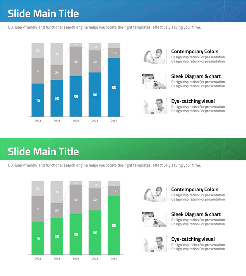
A vertical bar chart PowerPoint slide visualizing science experiment analysis data across five years from 2022 to 2030. The slide uses a blue color palette to distinguish primary data values (45, 50, 55, 60, 80) from cumulative gray data, with clear numerical labels on each bar. Optimized for 16:9 widescreen format in a 2-slide set, this presentation template is ready for immediate use in data trend analysis and year-over-year performance comparisons. Perfect for displaying experimental results, research metrics, sales figures, and other quantitative information in academic and business presentations.
Usage Points
-
Main Usage
This slide is optimized for clearly comparing and analyzing numerical data trends across multiple years. It effectively visualizes changes in science experiment results, sales performance, or research metrics over time, enhancing audience comprehension through visual representation.
-
How to Use
Insert this slide into presentation sections requiring year-over-year data comparison. Simply edit the bar heights and numerical values to match your data, and adjust colors and fonts to align with your company branding for immediate deployment.
-
Recommended For
Ideal for research presentations in science and medical fields, corporate performance reports, sales data analysis presentations, academic seminars, and business outcome briefings. Recommended for researchers, data analysts, marketers, planners, and professionals who need to communicate quantitative trends.
-
Slide Structure
2-slide set featuring vertical bar charts with dual-layer data representation: blue bars for primary metrics and gray overlays for cumulative data. Each chart displays 5 years of data with numerical labels above bars. Right side includes 3 descriptive text items with accompanying icons for context and interpretation.
Related Products
-

Bar Graph of Progress Analysis by Task - Effective Visualization of Progress
#Product/Service Introduction #Market and Competitor Analysis #Marketing Plan and Strategy
-

Segmented Analysis of Interior Trends – Data Visualization for Market Analysis
#Market and Competitor Analysis #Financial Plans and Performance #Graph
-

Social Network Market Analysis Bar Chart – Trends Insight
#Product/Service Introduction #Market and Competitor Analysis #Graph
-

Technology Status Analysis Graph – Presenting Market Trends
#Market and Competitor Analysis #Financial Plans and Performance #Graph
