Vertical Bar Chart Visualizing Monthly Performance – Contemporary Design
RJ0300079_22
- Last Update 10/11/2025
- File Size 0.3MB
- # of Slides 2
- File Format PPTX
- Slide Ratio 16:9
- Color
Keywords
- #Content-Based Slides
- #Design-Based Slides
- #Product/Service Introduction
- #Market and Competitor Analysis
- #Graph
- #Development Status
- #Market Analysis
- #Column
- #Segmented Column
- #16:9
- #vertical bar chart PowerPoint
- #monthly performance slide
- #data visualization template
- #bar graph presentation
- #monthly sales chart
- #comparison analysis slide
About the Product
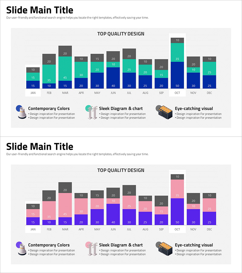
A vertical bar chart PowerPoint slide designed to visualize monthly performance data across 12 months with intuitive comparison capabilities. The slide features three data series in dark blue, teal, and gray color schemes, with numerical labels positioned above each bar segment for precise value identification. Ideal for business presentations, quarterly reports, and strategic planning documents where sales figures, revenue trends, visitor metrics, or KPI progression need clear visual representation. The 2-slide set includes a color variation option (teal-pink-gray combination) allowing flexible adaptation to your presentation theme and corporate branding.
Usage Points
-
Main Usage
Transforms monthly, quarterly, or annual performance metrics into clear visual comparisons using stacked vertical bars, enabling stakeholders to quickly identify trends, seasonal patterns, and inter-series performance gaps across the calendar year.
-
How to Use
Deploy in financial reports' performance analysis sections, business plan presentations for goal-versus-actual comparisons, investor pitch decks for growth trajectory visualization, and marketing strategy documents for campaign effectiveness measurement and ROI tracking.
-
Recommended For
Finance and accounting professionals, sales managers, marketing strategists, project leads, executive teams preparing performance reviews, and academic researchers presenting quantitative findings requiring temporal comparison.
-
Slide Structure
Horizontal axis displays 12 months (JAN through DEC), vertical axis shows numerical scale. Three data series rendered as stacked bar segments with color differentiation. Numerical value labels positioned above each bar section. Legend with three category indicators and descriptive text area for context or insights.
Related Products
-

Bar Graph of Progress Analysis by Task - Effective Visualization of Progress
#Product/Service Introduction #Market and Competitor Analysis #Marketing Plan and Strategy
-

Social Network Market Analysis Bar Chart – Trends Insight
#Product/Service Introduction #Market and Competitor Analysis #Graph
-

Correlation Analysis Vertical Bar Graph – Visualize Data to Enhance Competitiveness
#Product/Service Introduction #Market and Competitor Analysis #Graph
-

Sales Profit Margin Change Factor Analysis via Vertical Bar Chart
#Business Strategy #Market and Competitor Analysis #Graph
