Market Analysis Area Graph – Visual Data Representation
RJ0700005_8
- Last Update 07/23/2025
- File Size 0.3MB
- # of Slides 2
- File Format PPTX
- Slide Ratio 16:9
- Color
Keywords
About the Product
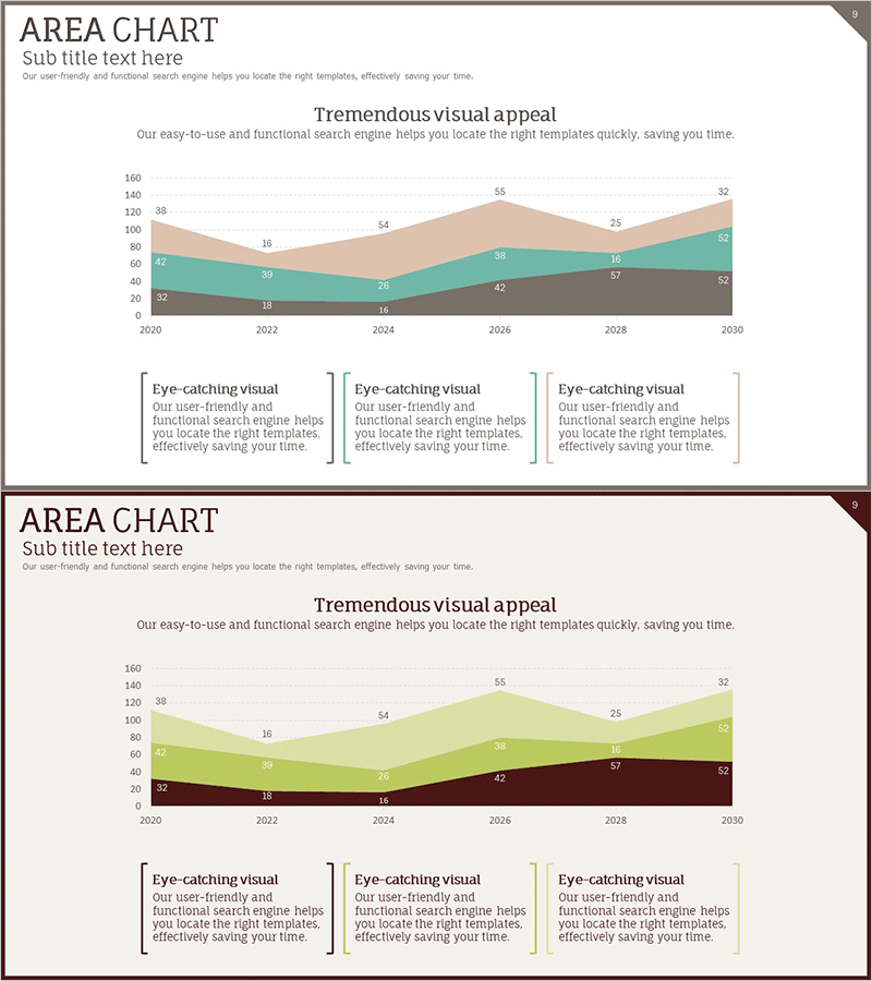
An area chart PowerPoint slide designed to visualize multi-series data such as market analysis, sales trends, and financial performance. This presentation template displays four data series (brown, teal, light green, and beige) from 2020 to 2030 using stacked area visualization, allowing viewers to understand both total volume and individual contribution simultaneously. Provided in 16:9 widescreen PPTX format with numerical labels and legend, it is ready for immediate use in business reports, sales presentations, marketing plans, and financial summaries.
Usage Points
-
Main Usage
Optimized for visualizing cumulative trends of multiple data series over time. Effectively displays market share evolution, revenue composition by segment, departmental sales growth, and customer distribution changes, enabling audiences to grasp both overall magnitude shifts and individual contribution patterns at a glance.
-
How to Use
Insert this slide into market analysis, financial status, or business performance sections of presentations. Edit the series colors and data values to match your dataset for immediate deployment. The legend and axis labels enhance audience comprehension of complex multi-series information.
-
Recommended For
Ideal for executive reports, investor pitch decks, business plans, marketing strategies, quarterly performance reviews, and market research presentations. Recommended for business analysts, marketing professionals, financial officers, and executives preparing data-driven presentations.
-
Slide Structure
Two-slide set. First slide features a 4-series stacked area chart (brown, teal, light green, beige) spanning 2020–2030 with numerical data labels and three descriptive text boxes. Second slide presents the same data in a 3-series variant (brown, light green, beige) for alternative visualization options.
Related Products
-

User Analysis Graph by Age Group – Advanced Data Insights
#Market and Competitor Analysis #Diagram #Graph
-

Sea Lighthouse Goal Market Strategy Line Graph – Revenue and Profit Growth
#Market and Competitor Analysis #Financial Plans and Performance #Graph
-

Gauge Charts by Region – Market Analysis and Competitiveness
#Market and Competitor Analysis #Graph #Other
-

Orange Purple Comparative Chart – Effective Data Visualization
#Graph
