Preference Analysis Graph by Plastic Surgery Field
RJ0700005_27
- Last Update 07/22/2025
- File Size 0.3MB
- # of Slides 2
- File Format PPTX
- Slide Ratio 16:9
- Color
Keywords
- #Content-Based Slides
- #Design-Based Slides
- #Market and Competitor Analysis
- #Marketing Plan and Strategy
- #Diagram
- #Graph
- #Competitor Analysis
- #Target Market Strategy
- #Cluster
- #Column
- #Closed Cluster Diagram
- #Grouped Column
- #16:9
- #grouped column chart PowerPoint
- #multi-series bar graph template
- #preference analysis slide
- #market research data visualization
- #category comparison chart download
About the Product
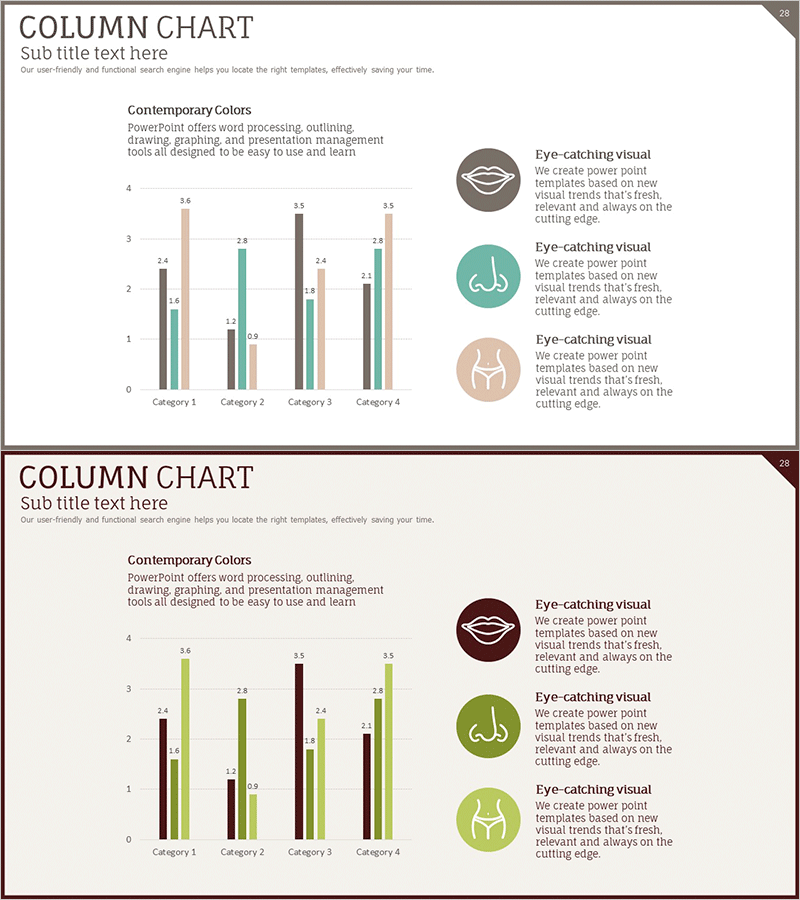
A grouped column chart PowerPoint slide comparing multi-series data across four categories with beige, teal, gray, and burgundy color coding. Each data point includes numeric labels for precise value communication. This presentation template is optimized for preference surveys, satisfaction assessments, and comparative analysis in medical, cosmetic, and market research fields. The 16:9 widescreen format includes two slide layouts ready for immediate editing and deployment.
Usage Points
-
Main Usage
Simultaneously compare multiple data series across different categories in a single visualization. Ideal for preference surveys, satisfaction ratings, market share comparisons, and performance benchmarking in medical and cosmetic industries. Numeric labels on each bar ensure accurate data communication.
-
How to Use
Insert into executive reports, marketing plans, research presentations, or institutional performance analyses. Replace category names and series labels with your data, then update bar heights and numeric values. Maintaining the color scheme preserves visual consistency across your presentation.
-
Recommended For
Medical institutions, cosmetic surgery clinics, marketing teams, market research analysts, business executives, academic presenters, and consulting firms presenting quantitative comparative data to stakeholders.
-
Slide Structure
Two slide layouts featuring 4 categories (Category 1–4) with 4 data series each (beige, teal, gray, burgundy bars). Numeric labels range from 0.9 to 3.6. Right-side panel includes three icon-based explanation text areas. 16:9 widescreen format.
Related Products
-

Competitive Companies Comparison Graph – A Powerful Tool for Market Analysis
#Market and Competitor Analysis #Diagram #Graph
-

Clustered Vertical Bar Graph Slide – Visualizing Market Analysis
#Market and Competitor Analysis #Diagram #Graph
-

Competitor Comparison Analysis Bar Graph – Data Visualization for Market Analysis
#Market and Competitor Analysis #Diagram #Graph
-

Experimental Results Analysis Vertical Bar Graph – Incorporating Visual Trends
#Market and Competitor Analysis #Diagram #Graph
