Plastic Surgery Data Analysis Donut Pie Chart Slide
RJ0700005_26
- Last Update 07/22/2025
- File Size 2.9MB
- # of Slides 2
- File Format PPTX
- Slide Ratio 16:9
- Color
Keywords
About the Product
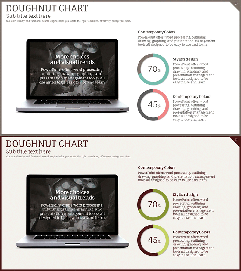
A donut pie chart PowerPoint slide designed for plastic surgery data analysis and healthcare statistics visualization. This 2-slide presentation features dual ratio representation (70% and 45%) with laptop mockup backgrounds, ideal for medical and cosmetic industry presentations. The slides incorporate turquoise, pink, burgundy, and olive color combinations to distinguish data series, formatted in 16:9 widescreen PPTX for immediate editing. Perfect for healthcare institutions, cosmetic clinics, and medical marketing teams presenting statistical data and patient satisfaction metrics.
Usage Points
-
Main Usage
Visualize plastic surgery and medical statistics using donut pie charts with dual ratio focus. The slide presents 70% and 45% metrics simultaneously for comparative analysis in healthcare industry presentations. Laptop mockup background enhances presentation context and professional appearance.
-
How to Use
Use in healthcare institution presentations, cosmetic clinic reports, and medical marketing seminars to display patient satisfaction rates, procedure statistics, and market share data. The 2-slide set allows direct editing of chart values and labels via double-click functionality. Color combinations can be customized to match your healthcare brand identity and institutional guidelines.
-
Recommended For
Healthcare marketing professionals, cosmetic surgeons, healthcare consultants, medical data analysts, and hospital administrators presenting patient data, procedure outcomes, and satisfaction surveys. Ideal for medical academic presentations, hospital management reports, and healthcare industry seminars requiring credible data visualization.
-
Slide Structure
2-slide layout featuring laptop mockup backgrounds with dual donut pie charts per slide. Each chart displays a central circular area and outer donut ring, color-coded in turquoise, pink, burgundy, and olive to represent different data series. Legend and descriptive text areas are positioned on the right side for clear data interpretation.
Related Products
-

Technology Achievement Donut Chart
#Product/Service Introduction #Business Introduction #Graph
-

Data Status Analysis Pie Chart – Intuitive Visualization
#Product/Service Introduction #Graph #Other
-

Five Color PowerPoint Template Wide – Donut Chart
#Product/Service Introduction #Business Vision and Strategy #Graph
-

Equipment Demand Survey with Donut Chart – Data Visualization
#Product/Service Introduction #Graph #Other
