Market Analysis Bar Graph – The Essence of Data Visualization
RJ0700005_21
- Last Update 07/22/2025
- File Size 0.3MB
- # of Slides 2
- File Format PPTX
- Slide Ratio 16:9
- Color
Keywords
About the Product
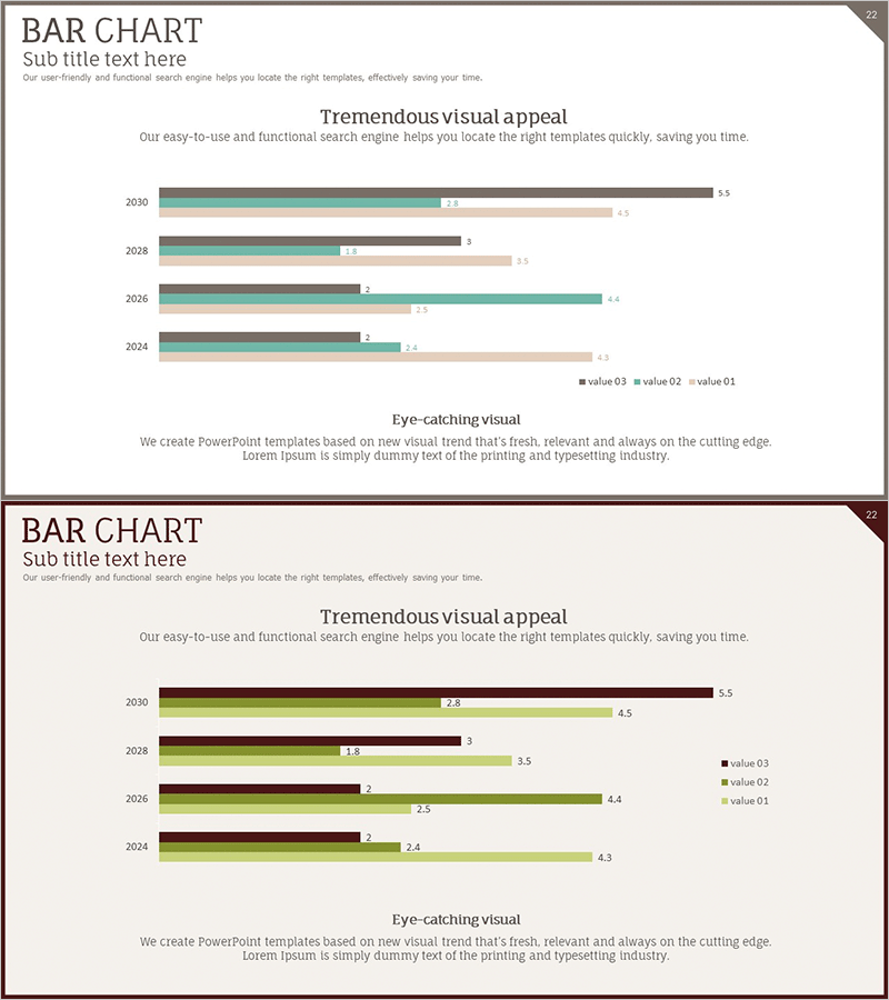
A horizontal bar chart PowerPoint slide comparing data across 4 years (2024–2030) with 3 data series. Teal, brown, and beige bars clearly distinguish each series, with numeric labels displaying exact values. This data visualization slide is ready for immediate use in market analysis presentations, performance reports, and business forecasts. Perfect for slides, presentations, and reports requiring quantitative data comparison and trend analysis.
Usage Points
-
Main Usage
Visualize year-over-year and item-by-item numerical comparisons and trend analysis. Effectively communicate quantitative data such as market performance, sales figures, KPIs, and budget allocations, enhancing audience comprehension of key metrics.
-
How to Use
Insert into market analysis sections, competitive benchmarking, departmental performance reviews, financial reports, and business plan presentations. The bar length and color coding enable intuitive comparison, while numeric labels provide precise values simultaneously for clear data storytelling.
-
Recommended For
Ideal for marketing, sales, finance, and strategy professionals presenting data-driven insights. Use in business plans, quarterly reports, investor pitch decks, and proposals to establish quantitative credibility. Strengthens presentations to executives, clients, and stakeholders with visual evidence.
-
Slide Structure
2-slide set featuring the first slide with teal, brown, and beige bars comparing 4 years (2024, 2026, 2028, 2030), and the second slide with an alternate color scheme (brown, green, beige). Numeric labels appear at bar ends with a legend identifying each series.
Related Products
-

Business Development Radial Diagram – Innovative Business Strategy
#Product/Service Introduction #Technical Approach #Graph
-

Market Share Donut Pie Chart – Visualization of Data Analysis
#Company Introduction #Market and Competitor Analysis #Diagram
-

Future Outlook Vertical Bar Graph – Business Strategy Analysis
#Business Strategy #Market and Competitor Analysis #Graph
-

Market Share Analysis Graph – Efficient Data Visualization
#Product/Service Introduction #Market and Competitor Analysis #Diagram
