Office Supplies Theme Double Bar Graph – Clear Visualization of Data
RJ0300063_13
- Last Update 05/05/2025
- File Size 4.3MB
- # of Slides 2
- File Format PPTX
- Slide Ratio 16:9
- Color
Keywords
- #Content-Based Slides
- #Design-Based Slides
- #Market and Competitor Analysis
- #Graph
- #Competitor Analysis
- #Competitive Advantage
- #Horizontal Bar
- #Double Horizontal Bar
- #16:9
- #double bar chart PowerPoint
- #horizontal bar graph template
- #data comparison slide
- #competitive analysis presentation
- #side-by-side comparison template
About the Product
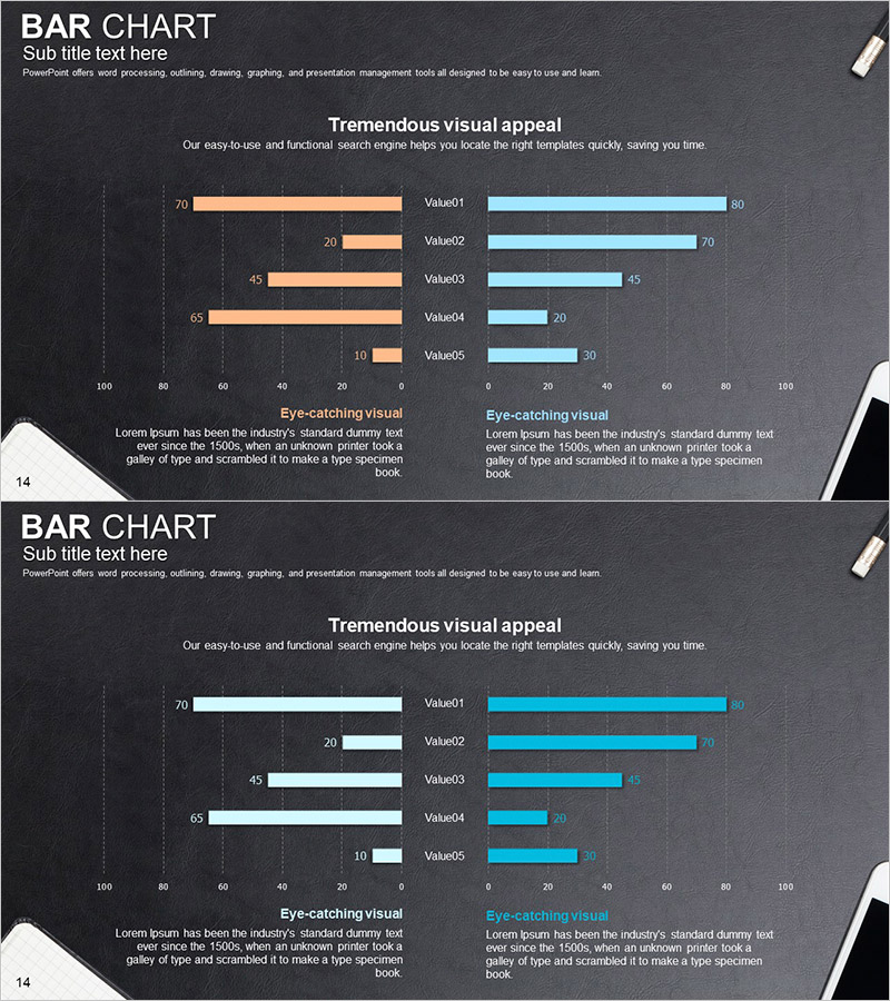
A 2-slide PowerPoint presentation featuring double bar charts with contrasting orange and sky blue bars on a dark background. Each slide compares five data points (Value01 through Value05) using a left-right symmetrical layout, ideal for competitive analysis, performance benchmarking, departmental metrics, and side-by-side comparisons. The slides maintain consistent data structure while offering layout variations for flexible presentation scenarios. Delivered in 16:9 widescreen PPTX format compatible with all modern presentation environments.
Usage Points
-
Main Usage
Visualizes two data series in left-right symmetrical arrangement to highlight contrasts and comparisons. Ideal for competitive benchmarking, departmental performance analysis, time-period comparisons, product A vs. B performance metrics, and any scenario requiring simultaneous visualization of opposing or related datasets.
-
How to Use
Modify bar lengths to input your actual data values. Replace Value01–Value05 labels with your category names and update numerical values accordingly. Adjust colors if needed to match corporate branding. The high-contrast design on dark background ensures excellent readability in projector environments.
-
Recommended For
Executive reports, quarterly performance reviews, marketing strategy meetings, sales analysis presentations, product comparison decks, organizational benchmarking materials, and business intelligence dashboards. Particularly effective for quantitative data-driven presentations requiring credible visual representation.
-
Slide Structure
Both slides feature identical structure: dark gray background + title area + descriptive text + 5-item double bar chart (left orange, right sky blue) + numerical labels + bottom explanation section. Slide 1 uses orange-left/blue-right arrangement; Slide 2 reverses to blue-left/orange-right, enabling flexible comparison scenarios.
Related Products
-

Comparative Analysis of Sales of Camping Competitors – Insights and Comparisons
#Market and Competitor Analysis #Graph #Competitor Analysis
-

Halloween Witch and Two-way Graph
#Market and Competitor Analysis #Graph #Competitor Analysis
-

Competitor Analysis and Competitive Advantage – Red, Blue, Purple Bar Chart
#Market and Competitor Analysis #Graph #Competitor Analysis
-

Competitor Analysis Bilinear Bar Graph – Identify Market Advantage
#Market and Competitor Analysis #Graph #Competitor Analysis
