Soft Line Graph – Market and Competitor Analysis
RJ0700005_10
- Last Update 07/22/2025
- File Size 0.3MB
- # of Slides 2
- File Format PPTX
- Slide Ratio 16:9
- Color
Keywords
About the Product
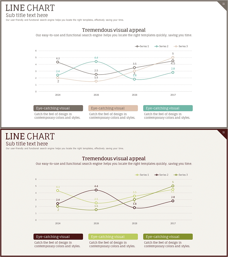
A multi-series line chart PowerPoint slide optimized for market and competitor analysis presentations. This template tracks data changes from 2024 to 2027 across three distinct series, enabling simultaneous comparison of multiple performance indicators. The design uses three color-coded series—charcoal, beige, and teal—for clear visual differentiation, with numerical labels at each data point ensuring precise information delivery. The slide deck is ready to use in business proposals, quarterly reports, strategic presentations, and investor pitches.
Usage Points
-
Main Usage
Visualizes time-series data such as market size, growth rates, and competitor market share to reveal trends and patterns at a glance. The multi-series format allows stakeholders—investors, executives, and clients—to compare multiple metrics simultaneously and make data-driven decisions based on clear visual evidence.
-
How to Use
Insert this slide into business plans, quarterly performance reports, marketing strategy presentations, and investor pitch decks in the market analysis section. Replace the sample data with your own figures, adjust the series labels and axis titles to match your context, and customize the legend and subtitle text as needed.
-
Recommended For
Marketing managers, strategy consultants, sales directors, and financial analysts benefit from this template when presenting market conditions and competitive positioning. Ideal for quarterly business reviews, new product proposals, investor meetings, and client presentations where data-backed analysis is essential.
-
Slide Structure
Two-slide set, each featuring a line chart with four time periods (2024, 2026, 2028, 2027) on the X-axis and a 0–6 scale on the Y-axis. Three color-coded series intersect and diverge to show comparative trends. Numerical labels appear at each data point for accuracy. A legend with three color blocks and descriptive text area is positioned below the chart.
Related Products
-

Competitor Analysis Line Chart – Business Meeting Template Cover
#Business Strategy #Market and Competitor Analysis #Graph
-

VR Business Market Analysis Broken Line Graph – Competitive Advantage and Trend Analysis
#Market and Competitor Analysis #Graph #Competitor Analysis
-

Line Graph Analysis Slide – Analyze the Market with Blue and Navy
#Market and Competitor Analysis #Graph #Competitor Analysis
-

Blue Green Broken Line Graph – Optimized for Competitor Analysis Design
#Market and Competitor Analysis #Graph #Competitor Analysis
