Blue Green Broken Line Graph – Optimized for Competitor Analysis Design
RJ0400047_17
- Last Update 05/30/2025
- File Size 1.5MB
- # of Slides 2
- File Format PPTX
- Slide Ratio 16:9
- Color
Keywords
About the Product
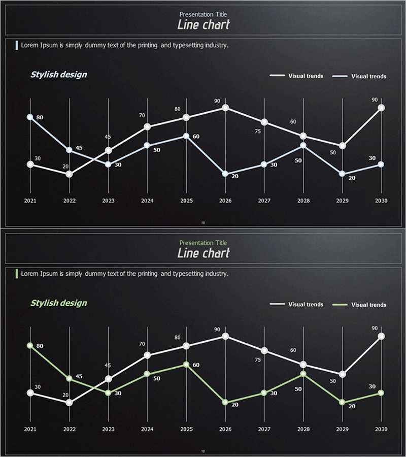
A dual-series line chart PowerPoint slide visualizing data changes across a 10-year period from 2021 to 2030. Designed with a dark background and white and green trend lines, this slide is optimized for competitor analysis, market trend presentations, and performance comparisons. The 2-slide set presents the same data structure in different color combinations for flexible customization. Vertical gridlines and clearly labeled data points enable immediate editing and professional presentation. Ideal for business reports, marketing analysis, software performance benchmarks, and data-driven decision-making materials.
Usage Points
-
Main Usage
Compare two or more data series over time to reveal performance gaps and trend patterns. Ideal for benchmarking competitor metrics, tracking market share evolution, monitoring product performance indicators, and visualizing revenue or customer satisfaction trends simultaneously for compelling comparative analysis.
-
How to Use
Input monthly, quarterly, or annual data from 2021 through 2030 into the chart. Edit series names in the legend and double-click data points to update values. Customize line colors from the default white and green to blue, orange, red, or any corporate palette. Adjust gridlines and axis labels as needed for your specific dataset.
-
Recommended For
Executives, marketing managers, sales teams, business analysts, and consultants use this slide for competitive benchmarking, market analysis, business performance reporting, and investor pitch decks. Essential for strategy meetings and board presentations requiring quantitative evidence and credible data visualization.
-
Slide Structure
Two identical slides each display dual trend lines (Visual trends 1 and 2) across 10 years on the X-axis and 0-100 scale on the Y-axis. Vertical gridlines provide reference, with data point values labeled at each node. Legend positioned in the upper right clearly distinguishes both series.
Related Products
-

Comparative Analysis Graph by Year – Data Visualization
#Product/Service Introduction #Market and Competitor Analysis #Graph
-

Line Graph Analysis Slide – Analyze the Market with Blue and Navy
#Market and Competitor Analysis #Graph #Competitor Analysis
-

Competitor Progress Comparison Analysis Graph – Essential Tool for Market Analysis
#Market and Competitor Analysis #Graph #Competitor Analysis
-

Infinite Energy Wide PPT Line Chart
#Market and Competitor Analysis #Financial Plans and Performance #Graph
