Science Experiment Analysis Circular Graph Table Chart – Innovation in Data Visualization
RJ0700001_9
- Last Update 07/21/2025
- File Size 0.7MB
- # of Slides 2
- File Format PPTX
- Slide Ratio 16:9
- Color
Keywords
- #Content-Based Slides
- #Design-Based Slides
- #Business Introduction
- #Technical Approach
- #Diagram
- #Graph
- #Revenue Model
- #Research and Development
- #Table
- #Horizontal Bar
- #Circles
- #Standard Table
- #Segmented Horizontal Bar
- #Pie Chart
- #16:9
- #pie chart PowerPoint slide
- #horizontal bar graph template
- #data visualization slides
- #scientific experiment chart
- #3-series comparison graph
- #circular graph presentation
About the Product
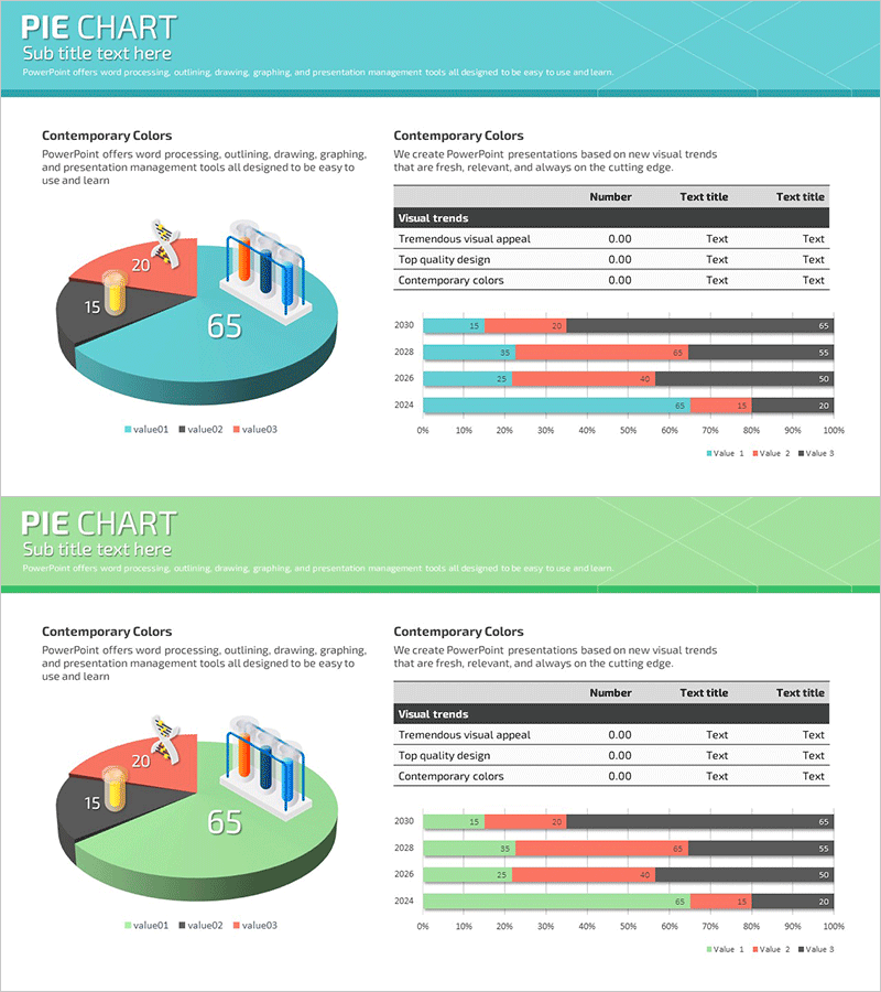
A 2-slide PowerPoint presentation designed for visualizing scientific experiment data and analytical results. The first slide combines a 3-series pie chart with a horizontal bar graph to display both proportions and numerical values simultaneously. The second slide features a stacked horizontal bar chart showing year-over-year trends alongside a data table for quantitative analysis. The design uses contrasting colors—turquoise, green, and orange—to clearly differentiate each data series, while the 3D pie chart adds visual impact. This slide deck is ready to use for R&D reports, experimental result presentations, and data analysis meetings.
Usage Points
-
Main Usage
Display scientific experiment data, research findings, and statistical analysis using pie charts and bar graphs simultaneously to compare proportions, values, and trends at a glance. The combination of 3D pie chart and stacked horizontal bar graph clarifies complex data structures.
-
How to Use
Use the first slide to present experimental results showing both composition ratios (pie chart) and item-by-item values (horizontal bar). The second slide displays year-over-year or quarterly trend data using stacked bars with supporting numerical data in the table. Edit chart legends, axis labels, and data values to match your specific dataset.
-
Recommended For
Recommended for researchers in science, medical, and pharmaceutical fields; R&D team presentations; data analysis reports; academic seminars; quality control statistical analysis; and marketing performance analysis presentations.
-
Slide Structure
Slide 1: 3D pie chart (3 series with 20, 15, 65 proportions) + horizontal bar graph (3 items) + data table. Slide 2: Year-over-year stacked horizontal bar chart (2030, 2028, 2026, 2024 with 3 series, 0–100% range) + legend + data labels. 16:9 widescreen format in turquoise, green, orange, and gray tones.
Related Products
-

Graph Charts for Systematic Market Analysis – Bar and Pie Charts
#Technical Approach #Market and Competitor Analysis #Diagram
-

Chemical Experiment Analysis Graph Chart – Visualizing R&D Achievements
#Technical Approach #Market and Competitor Analysis #Diagram
-

Pie Charts and Mini Illustrations – Visual Data Analysis Tool
#Technical Approach #Graph #Research and Development
-

Male and Female Real Estate Holding Status Graph – Market Share at a Glance
#Market and Competitor Analysis #Graph #Market Share
