Science Experiment Analysis Circle Graph Table Chart – Technological Advancement
RJ0700001_25
- Last Update 07/21/2025
- File Size 0.8MB
- # of Slides 2
- File Format PPTX
- Slide Ratio 16:9
- Color
Keywords
- #Content-Based Slides
- #Design-Based Slides
- #Product/Service Introduction
- #Technical Approach
- #Diagram
- #Graph
- #Development Status
- #Research and Development
- #Table
- #Circles
- #Doughnut Chart
- #16:9
- #doughnut chart PowerPoint slide
- #pie chart template download
- #percentage visualization
- #scientific data PowerPoint
- #two-series chart design
- #graph slide template
About the Product
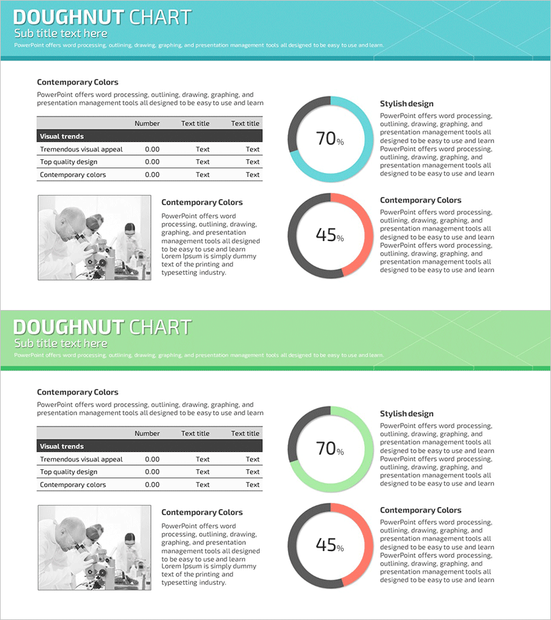
A doughnut chart PowerPoint slide designed for visualizing scientific experiment analysis and technological advancement metrics. Features two donut-shaped pie charts in turquoise and red tones displaying 70% and 45% key percentages, complemented by a data table on the left and descriptive text areas. Optimized for 16:9 widescreen format across 2 slides, this presentation template enables immediate use in reports, proposals, and analytical presentations with editable data fields and layout.
Usage Points
-
Main Usage
Displays and compares two key metrics—such as scientific experiment results or technology development progress rates—simultaneously using doughnut charts. The large percentage display in the chart center ensures immediate comprehension of critical figures, while the left table and text areas provide supporting details and context.
-
How to Use
Insert this slide into the analysis or results section of your presentation when comparing two data points or performance indicators. Edit the donut chart percentages and colors to match your actual data, then customize the table rows and text descriptions. The 16:9 aspect ratio ensures optimal display on widescreen monitors and projectors.
-
Recommended For
Recommended for research scientists, development teams, and technology planners presenting experimental findings or project progress. Also suitable for academic seminars, technical proposals, and performance review presentations where quantitative data visualization enhances audience understanding and engagement.
-
Slide Structure
Two-slide set with turquoise and red header sections respectively. Each slide contains a 3-row data table (Number, Text title, Text title columns) on the left, a centered doughnut chart showing percentage values, and a right-aligned text box with title and descriptive content for additional context.
Related Products
-

Blue Pink Circle Graph & Table Chart – Slide Highlighting Visual Appeal
#Product/Service Introduction #Operational Plan #Technical Approach
-

Mobile Development Status Analysis Graph – Market Analysis and Competitiveness
#Product/Service Introduction #Market and Competitor Analysis #Diagram
-

Donut Chart for Comparing Research Analysis Results
#Product/Service Introduction #Technical Approach #Graph
-

Profit Structure Analysis Donut Chart
#Product/Service Introduction #Business Introduction #Diagram
